12 Logistic Regression 2
12.1 Introduction
In the previous module, you learned about the logistic regression model, which is used when we have a binary response variable and at least one predictor. You learned how to interpret the model and carry out the relevant inferential procedures to answer various questions of interest. In this module, you will learn how to assess how well your logistic regression model does in classifying test data using the Receiver Operating Characteristic (ROC) curve, the Area Under the ROC Curve (AUC), and confusion matrices.
Going back to the drink driving dataset from the previous module, we fitted a logistic regression model to estimate the log odds and probability of driving drunk among college students, based on a number of predictors. How could we evaluate the predictive ability of our logistic regression model with our data?
With no access to more data, we will have to split our data into two portions: training data and test data. We use the training data to fit a logistic regression model. Then we use the model to estimate the probability of the observations in the test data of being in each class. We then use a decision rule or threshold to classify the observations in the test data (for example, if the estimated probability is greater than 0.5, classify the response as ``Yes”).
We found that using Smoke, Marijuan, and DaysBeer as predictors was preferred over using all predictors, via a likelihood ratio test. So we fit the model, use the model to estimate the predicted probabilities of the test data, and then use a threshold of 0.5 to classify the test data.
##fit model
reduced<-glm(DrivDrnk~Smoke+Marijuan+DaysBeer, family=binomial, data=train)

##predicted survival rate for test data based on training data
preds<-predict(reduced,newdata=test, type="response")

##add predicted probabilities and classification based on threshold
test.new<-data.frame(test,preds,preds>0.5)
##disply actual response, predicted prob, and classification based on threshold
head(test.new[,c(4,9,10)], )
## DrivDrnk preds preds...0.5
## 2 No 0.1166449 FALSE
## 3 Yes 0.1786671 FALSE
## 5 Yes 0.9608163 TRUE
## 6 No 0.8756158 TRUE
## 7 No 0.1166449 FALSE
## 9 Yes 0.8068613 TRUEFrom this output, we can read the values for the test data.
- The first column displays the actual response.
- The second column displays the predicted probability that the student has driven drunk based on our model.
- The last column displays whether the predicted probability is greater than the threshold of 0.5.
Row 1 corresponds to index 2 from the original dataframe. This student’s actual response is that the student has not driven drunk. Based on our logistic regression, this student’s predicted probability of having driven drunk is about 0.1166, which is less than the threshold of 0.5, so this student will be predicted to not have driven drunk (FALSE in the last column). So this student will be classified correctly based on our logistic regression and chosen threshold of 0.5.
However, notice row 2 in this output (corresponds to index 3 from the original dataframe). This student’s predicted probability is 0.1787 and would have been classified as not having driven drunk, based on a threshold of 0.5. However, this student actually has driven drunk. So this would be an incorrect classification.
So, we will want to summarize the number of correct and incorrect classifications, based on our test data. This is done via a confusion matrix.
12.2 Confusion Matrix
A confusion matrix is a two by two matrix (or table) that lists all possible combinations of the true response and the classification based on the model and threshold, as shown below in Figure 12.1 :
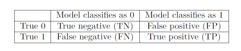
Figure 12.1: Confusion Matrix
The table is based on the dummy coding used for the binary response variable. Given that the response variable is binary, there are four possible combinations:
A true negative (TN) is an observation which is classified as 0 based on the logistic regression, and is itself truly a 0. For the drink driving example, true negatives are students who are classified as not having driven drunk by the model, and truly have not driven drunk.
A false positive (FP) is an observation which is classified as 1 based on the logistic regression, but is itself truly a 0. For the drink driving example, false positives are students who are classified as having driven drunk by the model, but truly have not driven drunk.
A false negative (FN) is an observation which is classified as 0 based on the logistic regression, but is itself truly a 1. For the drink driving example, false negatives are students who are classified as not having driven drunk by the model, but truly have driven drunk.
A true positive (TP) is an observation which is classified as 1 based on the logistic regression, and is itself truly a 1. For the drink driving example, true positives are students who are classified as having driven drunk by the model, and truly have driven drunk.
12.2.1 Metrics from confusion matrices
We have a number of metrics from confusion matrices:
Error rate: the proportion of incorrect classifications. From Table 5.1, this is calculated as \(\frac{FP + FN}{n}\), where \(n\) denotes the sample size of the test data and is the sum of all entries in the confusion matrix. Notice that FP and FN are numbers in the off-diagonal entries of the confusion matrix. In probability notation, this is denoted as \(P(\hat{y} \neq y)\).
Accuracy: the proportion of correct classifications. This is the complement of error rate, since accuracy and error rate have to add up 1. From Table 5.1 , this is calculated as \(\frac{TN + TP}{n}\). Notice that TN and TP are numbers in the diagonal entries of the confusion matrix. In probability notation, this is denoted as \(P(\hat{y} = y)\).
False positive rate (FPR): the proportion of true 0s that are incorrectly classified as 1s by the model. From Table 5.1, this is calculated as \(\frac{FP}{TN + FP}\). In probability notation, this is denoted as \(P(\hat{y} = 1 | y = 0)\).
False negative rate (FNR): the proportion of true 1s that are incorrectly classified as 0s by the model. From Table 5.1, this is calculated as \(\frac{FN}{FN + TP}\). In probability notation, this is denoted as \(P(\hat{y} = 0 | y = 1)\).
Sensitivity: the proportion of true 1s that are correctly classified as 1s by the model. Also sometimes called the true positive rate (TPR). Note that this is the complement of FNR, as sensitivity and FNR add up to 1. From Table 5.1, this is calculated as \(\frac{TP}{FN + TP}\). In probability notation, this is denoted as \(P(\hat{y} = 1 | y = 1)\).
Specificity: the proportion of true 0s that are correctly classified as 0s by the model. Also sometimes called the true negative rate (TNR). Note that this is the complement of FPR, as specificity and FPR add up to 1. From Table 5.1, this is calculated as \(\frac{TN}{TN + FP}\). In probability notation, this is denoted as \(P(\hat{y} = 0 | y = 0)\).
Precision: the proportion of observations classified as 1s that are truly 1s. From Table 5.1, this is calculated as \(\frac{TP}{FP + TP}\). In probability notation, this is denoted as \(P(y = 1 | \hat{y} = 1)\).
Let us look at the confusion matrix for our drink driving example, using 0.5 as a threshold:
##confusion matrix with 0.5 threshold
table(test$DrivDrnk, preds>0.5)
##
## FALSE TRUE
## No 46 12
## Yes 22 39Sample size of test data is \(n = 46+12+22+39 = 119\)
- Error rate is \(\frac{12+22}{119} = 0.2857143\)
- Accuracy is \(\frac{46+39}{119} = 0.7142857\)
- \(FPR\) is \(\frac{12}{46+12} = 0.2068966\)
- \(FNR\) is \(\frac{22}{22+39} = 0.3606557\)
- \(TPR\) is \(\frac{39}{22+39} = 0.6393443\)
- \(TNR\) is \(\frac{46}{46+12} = 0.7931034\)
- Precision is \(\frac{39}{12+39} = 0.7647059\)
12.2.1.1 Practice question
Suppose we change the threshold to 0.7 for our logistic regression. The subsequent confusion matrix is obtained:
##confusion matrix with 0.7 threshold
table(test$DrivDrnk, preds>0.7)
##
## FALSE TRUE
## No 50 8
## Yes 38 23For this confusion matrix, find the error rate, accuracy, FPR, FNR, TPR, TNR, and precision.
View the video below as I review this practice question.
12.2.2 Choice of threshold
If you worked through the practice question, you may realize that changing the threshold changes the values of the various metrics. Raising the threshold makes it more difficult for a test observation to be classified as 1 by the model. So the values in the first column of the confusion matrix increase, while the values in the second column decrease. Therefore raising the threshold:
- reduces FPR,
- increases FNR,
- reduces TPR,
- raises TNR
Depending on the context of the problem, we may be more interested in reducing one of FPR or FNR. Reducing one metric comes at the expense of increasing the other metric.
For our drink driving example, reducing the FPR means that students who truly have not driven drunk will be less likely to be incorrectly predicted to have driven drunk. We are less likely to falsely accuse an innocent student of driving drunk.
But this reduction in FPR comes at the expense of increasing the FNR. This means that students who have driven drunk will be less likely to be incorrectly predicted to not have driven drunk. We are less likely to identify students who will drive drunk.
We can see there are two very different consequences of these incorrect predictions. We either falsely accuse innocent students, or fail to intervene in behaviors of likely offenders. It will probably take consultation with a subject matter expert to decide which of the two errors are worse, or that we may want to balance the errors in some manner.
If it is clear that neither of the two errors are more consequential than the other, we are likely to want to focus on reducing the error rate. A threshold of 0.5 minimizes the error rate, on average.
12.3 ROC Curve and AUC
From the previous section, you may realize that the confusion matrix depends on the threshold. It may be a bit cumbersome to create confusion matrices and calculate the metrics across all possible thresholds. We can actually perform this calculations and display their results visually through a receiver operating characteristic (ROC) curve, or summarize the results using the area under the curve (AUC).
12.3.1 ROC curve
The name receiver operating characteristic (ROC) is derived from its initial use during World War II when analyzing radar signals. Users of radar wanted to distinguish signals due to enemy aircraft from signals due to noise such as a flock of birds.
- An ROC curve is a two-dimensional plot, with the sensitivity (TPR) on the y-axis and \(1 - \text{ specificity}\) (FPR) on the x-axis.
- The ROC curve plots the associated TPR and FPR for every possible value of the threshold (i.e., between 0 and 1).
Let us produce the ROC curve for our logistic regression for drunk driving based on three predictors Smoke, Marijuan, and DaysBeer:
library(ROCR)

##produce the numbers associated with classification table
rates<-ROCR::prediction(preds, test$DrivDrnk)

##store the true positive and false positive rates
roc_result<-ROCR::performance(rates,measure="tpr", x.measure="fpr")

##plot ROC curve and overlay the diagonal line for random guessing
plot(roc_result, main="ROC Curve for Reduced Model")
lines(x = c(0,1), y = c(0,1), col="red")
points(x=0.2068966, y=0.6393443, col="blue", pch=16)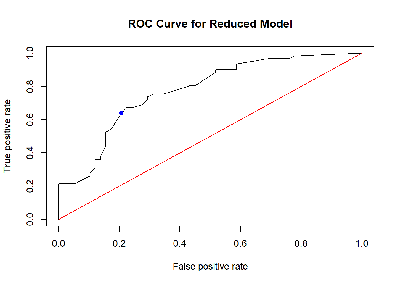
The ROC curve is the black curve on the plot, and displays the TPR and FPR of our logistic regression as we vary the threshold. Usually, a diagonal line is displayed as well (in red in the plot), and represents a model that classifies at random. We are comparing our black curve with the red diagonal line, to compare our model with a model that classifies at random.
-
A model that classifies at random will have an ROC curve that lies on the diagonal. In other words, a model that classifies at random has \(TPR = FPR\).
- A common misconception is that a model that classifies at random means that each test observation will have a 50-50 chance of being classified correctly or have a 50-50 chance of being classified as 1. These are incorrect.
- A model that classifies at random can be viewed as a model that does not use any information from the data to make its classification. This definition implies that \(P(\hat{y} = 1 | y = 1) = P(\hat{y} = 1 | y = 0)\), i.e. that \(TPR = FPR\). The probability of classifying an observation as 1 is not changed by what the data is telling the model.
A model that classifies all observations correctly will have a sensitivity and specificity of 1, so it will belong at the (0,1) position (i.e. top left) on the plot. The further the curve is from the diagonal and closer to the top left of the plot, the better the model is in classifying observations correctly. A curve that is above the diagonal indicates the model does better than random guessing.
A model that classifies all observations incorrectly will have a sensitivity and specificity of 0, so it will belong at the (1,0) position (i.e. bottom right) on the plot. The further the curve is from the diagonal and closer to the bottom right of the plot, the worse the model does in classifying observations. A curve that is below the diagonal indicates the model does worse than random guessing.
Going back to our ROC curve, our ROC above is above the diagonal so it does better than random guessing.
I have also added a point in solid blue that displays the TPR and FPR of our logistic regression with a threshold of 0.5, based on the calculations that we performed earlier. The TPR is 0.6393443 and the FPR is 0.2068966. Remember the black curve displays the TPR and FPR of our logistic regression as we vary the threshold.
12.3.2 AUC
The area under the curve (AUC) is, as its name suggests, the area under the ROC curve. It is a numerical summary of the corresponding ROC curve.
- For a model that randomly guesses, the AUC will be 0.5.
- An AUC closer to 1 indicates the model does better than random guessing in classifying observations. An AUC of 1 indicates a model that classifies all observations correctly.
- An AUC closer to 0 indicates a model that does worse than random guessing.
Let us look at the AUC for our logistic regression:
##compute the AUC
auc<-performance(rates, measure = "auc")
auc@y.values
## [[1]]
## [1] 0.7741662The AUC is around 0.7742, which is greater than 0.5, so it does better than random guessing.
12.4 Cautions with Classification
If you look at our ROC curve more closely, you will realize there a couple of places where the black ROC curve coincides with the red diagonal line. So there exist thresholds where our logistic regression performs as well as random guessing. The ROC curve shows the true positive and false positive rates as the threshold is varied. It does not immediately inform you of the true positive and false positive rates for your specific threshold. It is possible that even though the ROC is above the diagonal line, our model performs as well as random guessing for certain thresholds, which me may be proposing to use.
The AUC, just like the ROC, is a summary of the predictive performance for all possible values of the threshold. A common misconception is that the AUC is a measure of accuracy. It is not! It is simply the area under the ROC curve.
Be careful with just producing the ROC curve and AUC. Be sure to check the confusion matrix and the various metrics at the threshold that you are proposing.
12.4.1 Unbalanced sample sizes
Another situation to pay attention to is if your binary response variable is unbalanced. It is unbalanced if the proportions of the two levels are very different, i.e. one level is common, another level is rare. For example, if you are trying to classify whether an email you receive is spam or not. Chances are, most of the emails you receive are legitimate, while a few of the emails are spam. So the variable whether your email is spam or not is unbalanced.
With a response variable that is unbalanced, you could have a high accuracy for a threshold but yet your model is performing the same as random guessing.
Let us consider this spam email example. Suppose you receive 10,000 emails, and 20 of them are spam. Suppose you use a classifier that does not use any information about the emails, and decides to classify every single email as not spam. The resulting confusion matrix is shown in Figure 12.2:
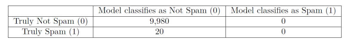
Figure 12.2: Confusion Matrix with Unbalanced Response
- The accuracy is \(\frac{9980}{10000} = 0.998\) which is extremely high! So if you just looked at accuracy, you may think that your model is doing great at detecting spam email, when in reality it fails to flag any spam email.
- For this confusion matrix, the TPR is 0, and the FPR is also 0, which implies our model is guessing at random.
So we see that with an unbalanced response variable, we need to look into more metrics such as TPR and FPR, and not solely rely on accuracy, to assess how well our model is classifying. Accuracy may be misleading with an unbalanced response variable.
Some workarounds include:
- Adjusting the threshold and reassess the TPR and FPR.
- Finding better predictors than can distinguish between the two levels.
- Adjusting the population of interest so the response variable is a bit more balanced.
Is having an unbalanced response variable always bad? Not necessarily:
- It is not guaranteed that accuracy will be misleading. TPR could be high and FPR could be low. We just need to double check.
- Recall the two main uses of models are prediction and association. Prediction can be challenging with unbalanced data, but we can still gain insights into how the predictors are related to the response variable.
12.4.2 Separation
Another issue to pay attention to is whether we have separation in our classification. Separation occurs when predictors almost perfectly predict the binary response variable. We have perfect or complete separation predictors perfectly predict the binary response variable.
The scatterplot below shows an example of perfect separation (using simulated data):
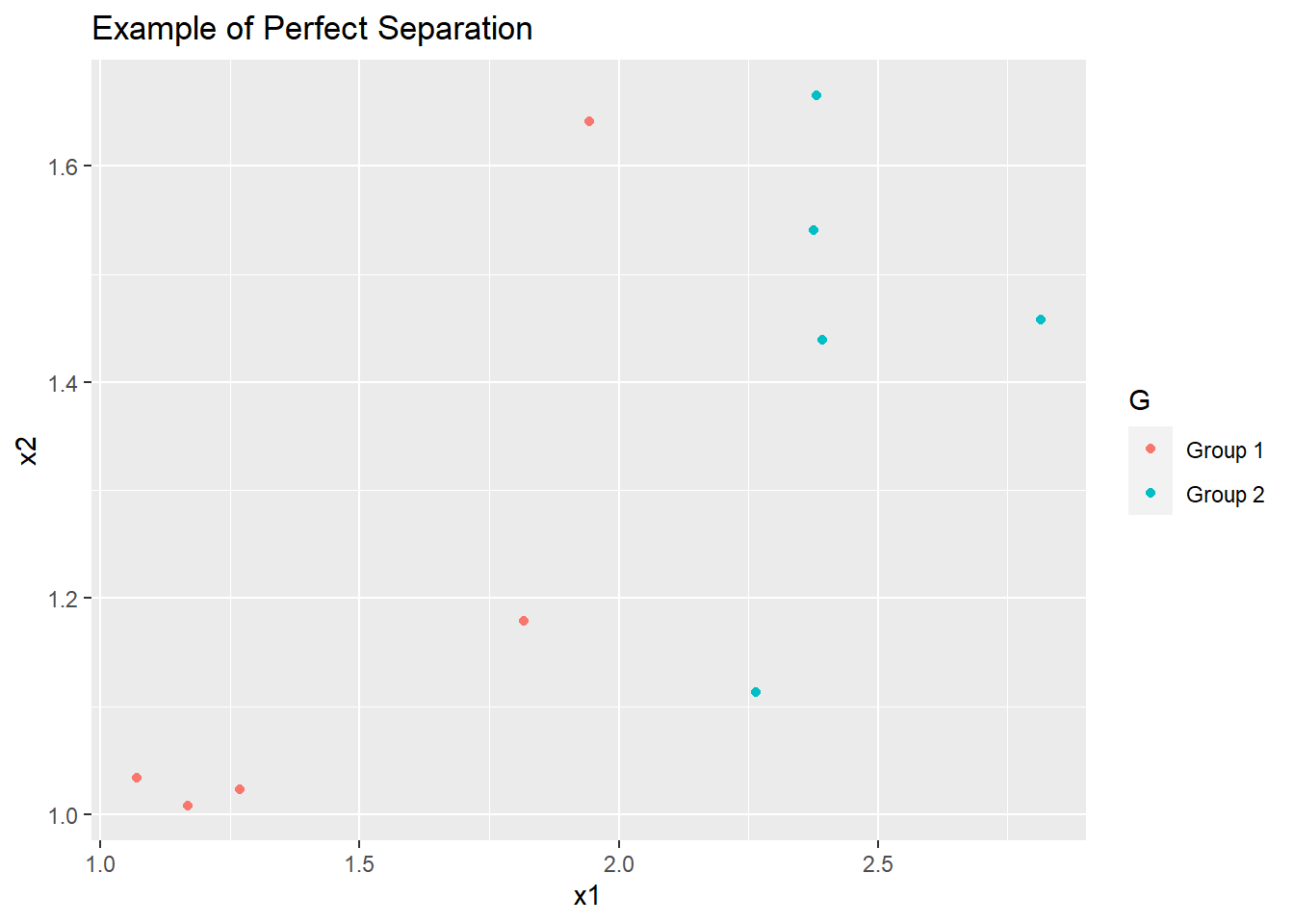
We can easily draw a straight line on this scatterplot (say at \(x1 = 2\)) that perfectly separates group 1 and group 2. To the left of this line is group 1, and to the right is group 2.
Recall the two main uses of models are prediction and association. Separation is what we want if we are using the model for prediction. However, separation poses challenges if we want to gain insights into how the predictors are related to the response variable.
The main issue with separation is that the standard errors of estimated coefficients get large. This implies that confidence intervals associated with coefficients are very wide, making interpretation of coefficients more challenging.
Suppose we try to fit logistic regression for this scatterplot. The glm() function will print out a warning message that some of the estimated probabilities are exactly 0 or 1. This warning message is an indication that perfect separation exists.
result.sep<-glm(G~., family=binomial, data=df)## Warning: glm.fit: fitted probabilities numerically 0 or 1 occurredSo what are things to consider when separation exists in our data?
The first thing to consider is whether this separation is expected to exist in the population of interest. If you have a small sample, it may be possible that the separation exists in the small sample, but does not exist in the population. If this is the case, then collecting more data is likely to break the separation.
If you are using logistic regression for prediction more so than exploring how the predictors relate to the response, you could do nothing, as you are not as interested in interpreting coefficients. In fact, separation is great for prediction.
You have to check whether any of your predictors is just another version of the binary response variable. For example, you are classifying whether newborn babies are premature or not. If you include a predictor which is the duration of the pregnancy, this predictor will perfectly classify whether the baby is premature or not, since premature pregnancies are based on the duration of pregnancies. We may still be interested in how other variables relate to premature births, so duration of pregnancy needs to be removed as a predictor from the model.
12.5 R Tutorial
In this tutorial, we will learn how to evaluate the predictive ability of a logistic regression model, via confusion matrices, the ROC curve, and the AUC.
We will continue to use the students.txt dataset from the previous tutorial, that contains information on about 250 college students at a large public university and their study and party habits. The variables are:
-
Gender: gender of student -
Smoke: whether the student smokes -
Marijuan: whether the student uses marijuana -
DrivDrnk: whether the student has driven while drunk -
GPA: student’s GPA -
PartyNum: number of times the student parties in a month -
DaysBeer: number of days the student drinks at least 2 beers in a month -
StudyHrs: number of hours the students studies in a week
Suppose we want to relate the likelihood of a student driving while drunk with the other variables.
Let us read the data in:
library(tidyverse)
Data<-read.table("students.txt", header=T, sep="")
We are going to perform some basic data wrangling for our dataframe:
- Remove the first column, as it is just an index.
- Apply
factor()to categorical variables. As a reminder, this should be done to categorical variables if you want to change the reference class.
##first column is index, remove it
Data<-Data[,-1]

##convert categorical to factors. needed for contrasts
Data$Gender<-factor(Data$Gender)
Data$Smoke<-factor(Data$Smoke)
Data$Marijuan<-factor(Data$Marijuan)
Data$DrivDrnk<-factor(Data$DrivDrnk)
We are going to split the dataset into equal portions: one a training set, and another a test set. Recall that the training set is used to build the model, and the test set is used to assess how the model performs on new observations. We use the set.seed() function so that we can replicate the same split each time this block of code is run. An integer needs to be supplied to the set.seed() function.
##set seed so results (split) are reproducible
set.seed(6021)

##evenly split data into train and test sets
sample.data<-sample.int(nrow(Data), floor(.50*nrow(Data)), replace = F)
train<-Data[sample.data, ]
test<-Data[-sample.data, ]
The set.seed() function allows us to have reproducible results. When we randomly split the data into a training and test set, we will get the same split each time we run this block of code.
The sample.int() function allows us to sample a vector of random integers.
- The first value is the maximum value of the integer we want to randomly generate, which in this case, will be the number of observations in our data frame.
- The second value represents the number of random integers we want to generate. In this case, this will be 50% of the number of observations, since we want a 50-50 split for the training and test data.
- The last value,
replace=F, means we want to sample without replacement, that means once an integer is sampled, it cannot be sampled again.
Recall from the previous tutorial that we should use three predictors, Smoke, Marijuan, and DaysBeer instead of all of them. So we fit this logistic regression:
##fit model
reduced<-glm(DrivDrnk~Smoke+Marijuan+DaysBeer, family=binomial, data=train)
Confusion Matrices
To create a confusion matrix, we need to find the predicted probabilities for our test data, then use the table() function to tabulate the number of true positives, true negatives, false positives, and false negatives via a confusion matrix:
##predicted probs for test data
preds<-predict(reduced,newdata=test, type="response")

##confusion matrix with threshold of 0.5
table(test$DrivDrnk, preds>0.5)
##
## FALSE TRUE
## No 48 11
## Yes 21 45I have placed the actual response in the rows, and whether the predicted probability is greater than the threshold of 0.5 (the classification based on the model) in the columns.
For our model with a threshold of 0.5, we have:
- 48 observations that truly have not driven drunk and were correctly classified as not having driven drunk (true negative).
- 11 observations that truly have not driven drunk but were incorrectly classified as having driven drunk (false positive).
- 45 observations that truly have driven drunk and were correctly classified as having driven drunk (true positive).
- 21 observations that truly have driven drunk but were incorrectly classified as not having driven drunk (false negative).
ROC Curve
The ROC curve plots the true positive rate (TPR) against the false positive rate (FPR) of the logistic regression as the threshold is varied from 0 to 1. We need a couple of functions from the ROCR package, so we load it and use the prediction() and performance() functions from it to create the ROC curve:
library(ROCR)
##produce the numbers associated with classification table
rates<-ROCR::prediction(preds, test$DrivDrnk)

##store the true positive and false postive rates
roc_result<-ROCR::performance(rates,measure="tpr", x.measure="fpr")

##plot ROC curve and overlay the diagonal line for random guessing
plot(roc_result, main="ROC Curve for Reduced Model")
lines(x = c(0,1), y = c(0,1), col="red")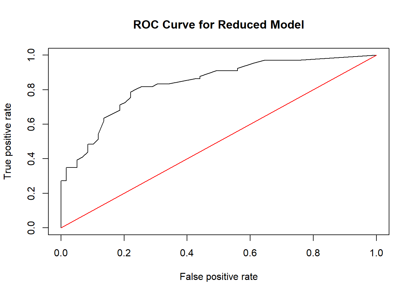
- The
prediction()function transforms the vector of estimated probabilities and the vector of the response for the test set into a format that can be used with theperformance()function to create the ROC curve. - The object
roc_resultstores the values of the true positive rate and false positive rate via theperformance()function. The argumentsmeasureandx.measureare used to plot the true positive rate on the y-axis and false positive rate on the x-axis respectively. - The function
lines()is used to overlay the diagonal line on the plot for ease of comparison between random guessing and our model’s classification ability.
As a reminder, the ROC curve gives us all possible combinations of TPRs and FPRs as the threshold is varied from 0 to 1. A perfect classification will result in a curve that has a TPR of 1 and FPR of 0, i.e. it will appear on the top left of the plot.
The red diagonal line represents a classifier that randomly guesses the binary outcome without using any information from the predictors. An ROC curve that is above this diagonal indicates the logistic regression does better than random guessing; an ROC curve that is below this diagonal does worse than random guessing. So we can see that our model does better than a classifier that randomly guesses.
AUC
Another measure is the AUC. As its name suggests, it is simply the area under the (ROC) curve. A perfect classifier will have an AUC of 1. A classifier that randomly guesses will have an AUC of 0.5. Thus, AUCs closer to 1 are desirable. To obtain the AUC of our ROC
##compute the AUC
auc<-ROCR::performance(rates, measure = "auc")
auc@y.values
## [[1]]
## [1] 0.8355162The AUC of our ROC curve is 0.8355, which means our logistic regression does better than random guessing.
Please view the video below for a demonstration of this tutorial.