2 Data Visualization with R Using ggplot2
2.1 Introduction
Data visualizations are tools that summarize data. Consider the visuals from the CDC covid tracker dashboard to an external site. Without actually having access to the actual data, we have a sense of trends associated with hospitalizations and deaths. Good visualizations are easy to interpret for a wide variety of audiences, and are easier to explain than statistical models.
In this module, you will learn how to create common data visualizations. The choice of data visualization is almost always determined by whether the variable(s) involved is categorical or quantitative. Discrete variables are interesting because depending on the circumstance, they can be viewed as either categorical or quantitative in the context of data visualizations.
We will be using functions from the ggplot2 package to create visualizations. The ggplot2 package enables users to create various kinds of data visualizations, beyond the visualizations that can be made in base R. The ggplot2 package is automatically loaded when we load the tidyverse package, although we can load ggplot2 on its own.
We will use the dataset ClassDataPrevious.csv as an example. The data were collected from an introductory statistics class at UVa from a previous semester. Download the dataset from Canvas and read it into R.
Data<-read.csv("ClassDataPrevious.csv", header=TRUE)The variables are:
-
Year: the year the student is in -
Sleep: how much sleep the student averages a night (in hours) -
Sport: the student’s favorite sport -
Courses: how many courses the student is taking in the semester -
Major: the student’s major -
Age: the student’s age (in years) -
Computer: the operating system the student uses (Mac or PC) -
Lunch: how much the student usually spends on lunch (in dollars)
2.2 Visualizations with a Single Categorical Variable
2.2.1 Frequency tables
Frequency tables are a common tool to summarize categorical variables. These tables give us the number of observations (sometimes called counts) that belong to each class of a categorical variable. These tables are created using the table() function. Suppose we want to see the number of students in each year in our data:
table(Data$Year)##
## First Fourth Second Third
## 83 30 139 46Notice the order of the years could be rearranged to make more sense:
## [1] "First" "Second" "Third" "Fourth"
mytab<-table(Data$Year)
mytab
##
## First Second Third Fourth
## 83 139 46 30So we have 83 first years, 139 second years, 46 third years, and 30 fourth years in our dataset.
We can report these numbers using proportions instead of counts, using prop.table():
prop.table(mytab)##
## First Second Third Fourth
## 0.2785235 0.4664430 0.1543624 0.1006711or percentages by multiplying by 100:
prop.table(mytab) * 100##
## First Second Third Fourth
## 27.85235 46.64430 15.43624 10.06711To round the percentages to two decimal places, use the round() function:
round(prop.table(mytab) * 100, 2)##
## First Second Third Fourth
## 27.85 46.64 15.44 10.07So about 27.85% of these students are first years, 46.64% are second years, 15.44% are third years, and 10.07% are fourth years.
2.2.2 Bar charts
Bar charts are a simple way to visualize categorical data, and can be viewed as a visual representation of frequency tables. To create a bar chart for the years of these students, we use:
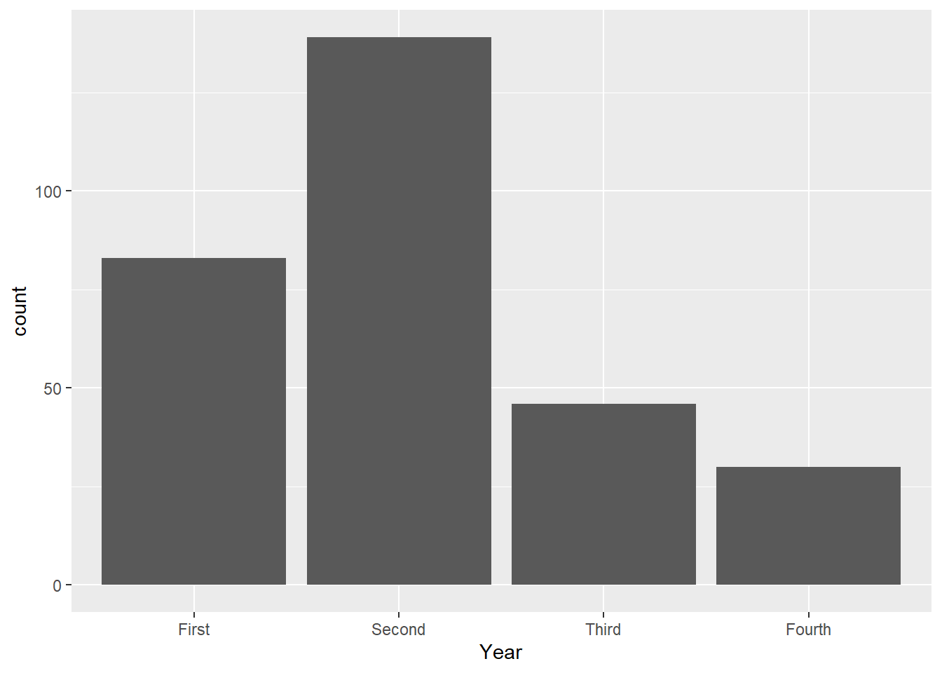
We can read the number of students who are first, second, third, and fourth years by reading off the corresponding value on the vertical axis.
From these two lines we code, we can see the basic structure of creating data visualizations with the ggplot() function:
Use the
ggplot()function, and supply the name of the data frame, and the x- and/or y- variables via the aes() function. End this line with a+operator, and then press enter.In the next line, specify the type of graph we want to create (called
geoms). For a bar chart, typegeom_bar().
Some describe these lines of code as two layers of code. These two layers must be supplied for all data visualizations with ggplot().
Additional optional layers can be added (these usually deal with the details of the visuals). Suppose we want to change the orientation of this bar chart, we can add an optional line, or layer:
ggplot(Data, aes(x=Year))+
geom_bar()+
coord_flip()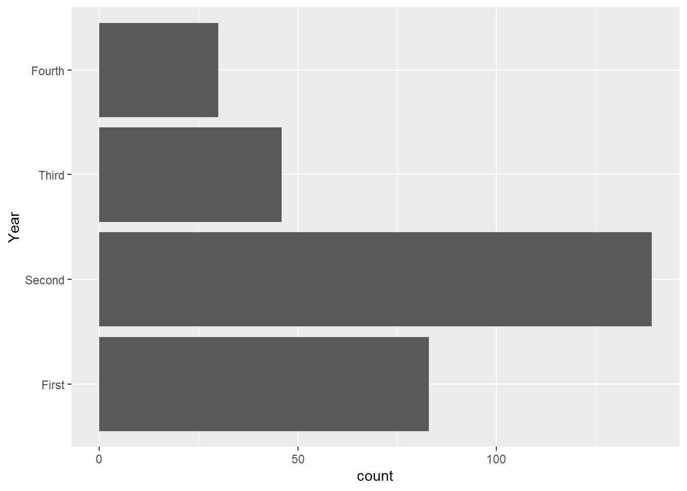
It is recommended that each layer is typed on a line below the previous layer. A + sign is used at the end of each layer to add another layer below.
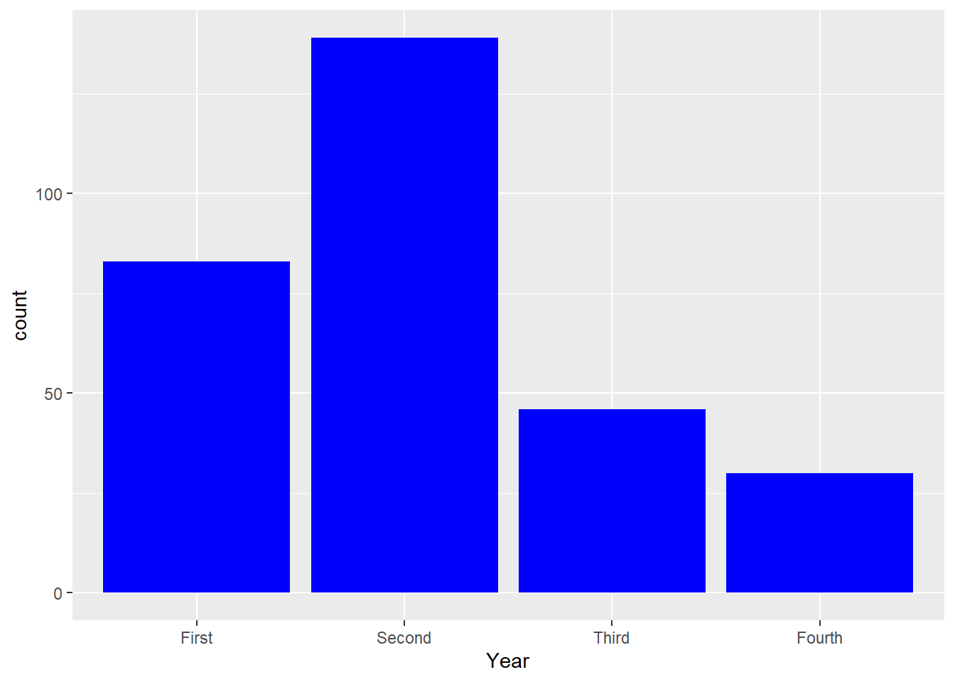
To change the color of the bars:
To have a different color to outline the bars:

2.2.2.1 Customize title and labels of axes in bar charts
To change the orientation of the labels on the horizontal axis, we add an extra layer called theme. This will be useful when we have many classes and/or labels with long names.
To rotate the labels on the horizontal by 90 degrees:
ggplot(Data, aes(x=Year))+
  geom_bar()+
  theme(axis.text.x = element_text(angle = 90))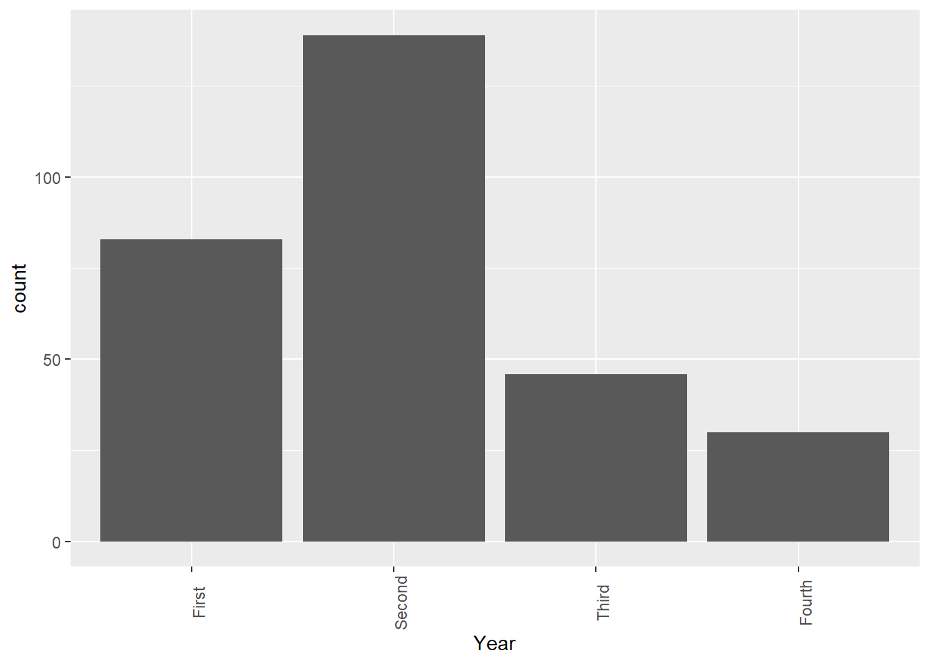
As we create more visualizations, it is good practice to give short but meaningful and descriptive names for each axis and provide a title. We can change the labels of the x- and y- axes, as well as add a title for the bar chart by adding another layer called labs:
ggplot(Data, aes(x=Year))+
  geom_bar()+
  theme(axis.text.x = element_text(angle = 90))+
  labs(x="Year", y="Number of Students", title="Dist of Years")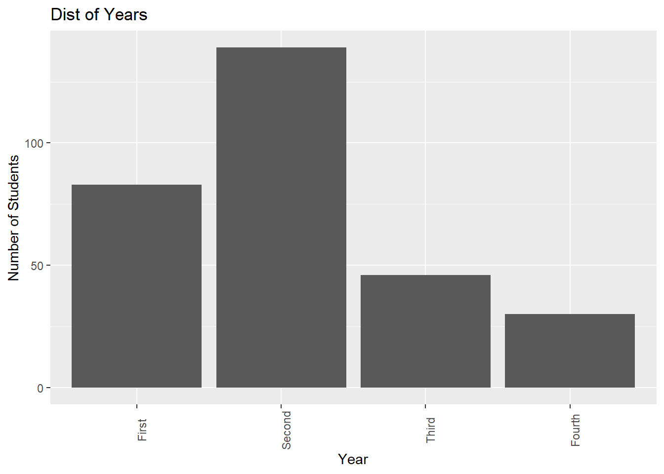
We can also adjust the position of the title, for example, center-justify it via theme:
ggplot(Data, aes(x=Year))+
  geom_bar()+
  theme(axis.text.x = element_text(angle = 90),
        plot.title = element_text(hjust = 0.5))+
  labs(x="Year", y="Number of Students", title="Dist of Years")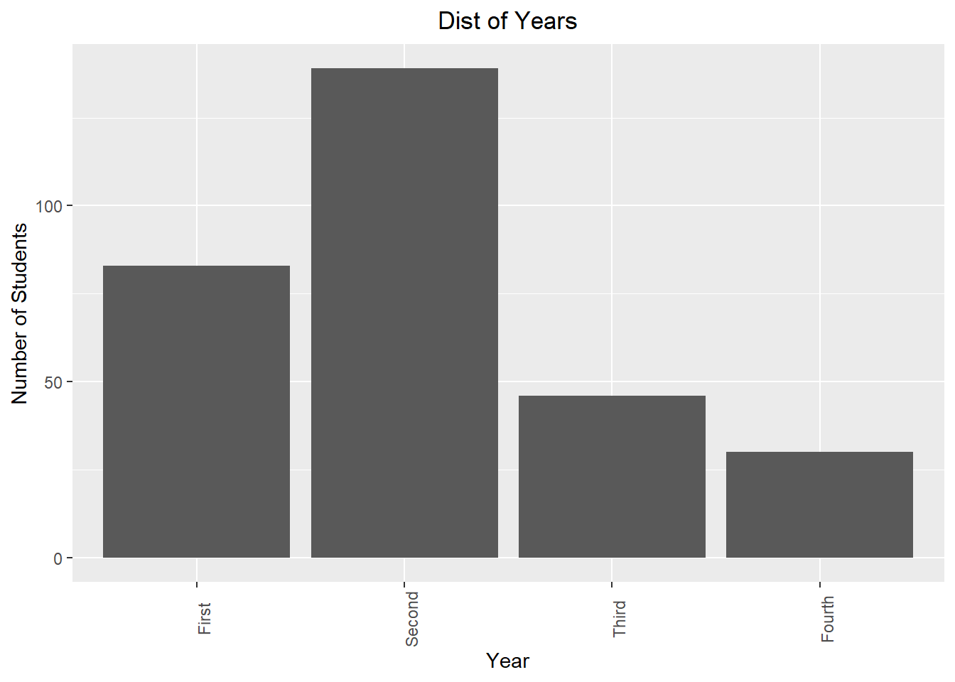
2.2.2.2 Create a bar chart using proportions
Suppose we want to create a bar chart where the y-axis displays the proportions, rather than the counts of each level. There are a few steps to produce such a bar chart. First, we create a new dataframe, where each row represents a year, and we add the proportion of each year into a new column:
The code above does the following:
- Creates a new data frame called
newDataby taking the data frame calledData, - and then groups the observations by
Year, - and then counts the number of observations in each
Yearand stores these values in a vector calledCounts, - and then creates a new vector called
Percentby using the mathematical operations as specified inmutate().Percentis added tonewData.
We can take a look at the contents of newData:
newData## # A tibble: 4 × 3
## Year Counts Percent
## <fct> <int> <dbl>
## 1 First 83 0.279
## 2 Second 139 0.466
## 3 Third 46 0.154
## 4 Fourth 30 0.101To create a bar chart using proportions:
ggplot(newData, aes(x=Year, y=Percent))+
  geom_bar(stat="identity")+
  theme(axis.text.x = element_text(angle = 90),
        plot.title = element_text(hjust = 0.5))+
  labs(x="Year", y="Percent of Students", title="Dist of Years")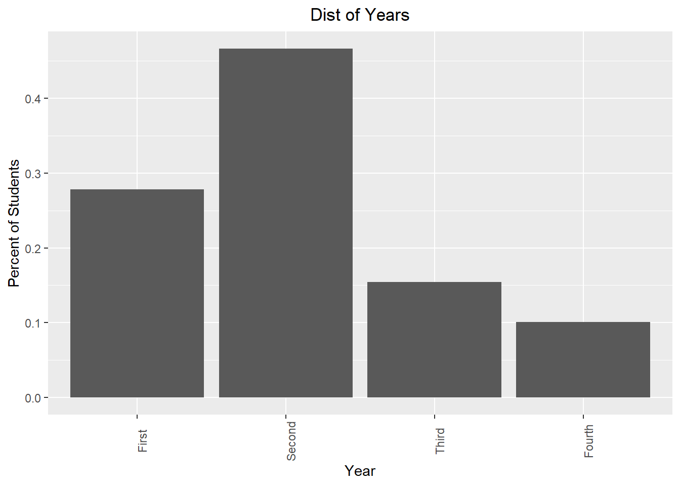
Note the following:
- In the first layer, we use
newDatainstead of the old data frame. Inaes(), we specified a y-variable, which we want to bePercent. - In the second layer, we specified
stat="identity"insidegeom_bar().
2.3 Visualizations with a Single Quantitative Variable
2.3.1 5 number summary
The summary() function, when applied to a quantitative variable, produces the 5 number summary: the minimum, the first quartile (25th percentile), the median (50th percentile), the third quartile (75th percentile), and the maximum, as well as the mean. For example, to obtain the 5 number summary of the ages of these students:
summary(Data$Age)## Min. 1st Qu. Median Mean 3rd Qu. Max.
## 18.00 19.00 19.00 19.57 20.00 51.00The average age of the observations in this dataset is 19.57 years old. Notice the first quartile and the median are both 19 years old, that means at least a quarter of the observations are 19 years old. Also note the maximum of 51 years old, so we have a student who is quite a lot older than the rest.
2.3.2 Boxplots
A boxplot is a graphical representation of the 5 number summary. To create a generic boxplot, we have the following two lines of code when using the ggplot() function:
ggplot(Data, aes(y=Age))+
  geom_boxplot()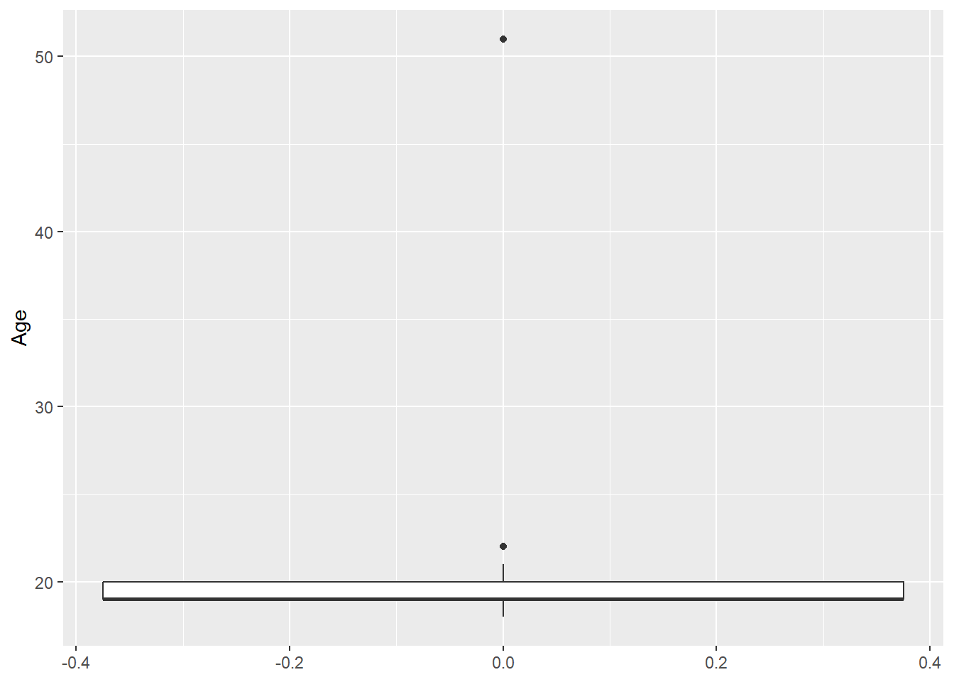
Note we are still using the same structure when creating data visualizations with ggplot():
Use the
ggplot()function, and supply the name of the data frame, and the x- and/or y- variables via the aes() function. End this line with a+operator, and then press enter.In the next line, specify the type of graph we want to create (called
geoms). For a boxplot, typegeom_boxplot.
Notice there are outliers (observations that are a lot older or younger) that are denoted by the dots. One is the 51 year old, and 22 year olds are deemed to be outliers. The rule being used is the \(1.5 \times IQR\) rule.
Similar to bar charts, we can change the orientation of boxplots by adding an additional layer as before:
ggplot(Data, aes(y=Age))+
  geom_boxplot()+
  coord_flip()
We can change the color of the box and the outliers similarly:
ggplot(Data, aes(y=Age))+
  geom_boxplot(color="blue", outlier.color = "orange" )
2.3.3 Histograms
A histogram displays the number of observations within each bin on the x-axis:
ggplot(Data,aes(x=Age))+
  geom_histogram()
## `stat_bin()` using `bins = 30`. Pick better value `binwidth`.Notice a warning message is displayed when creating a basic histogram. To fix this, we use the binwidth argument within geom_histogram. We try binwidth=1 for now, which means the width of the bin is 1 unit:
ggplot(Data,aes(x=Age))+
  geom_histogram(binwidth = 1,fill="blue",color="orange")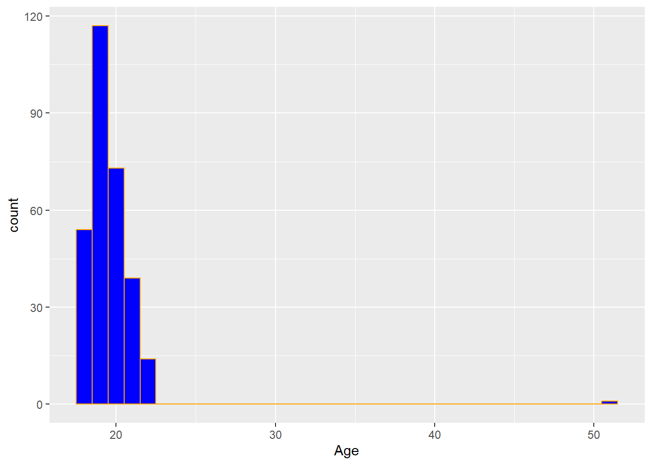
The ages of the students are mostly young, with 19 and 20 years olds being the most commonly occuring.
A well-known drawback of histograms is that the width of the bins can drastically affect the visual. For example, suppose we change the binwidth to 2:
ggplot(Data,aes(x=Age))+
  geom_histogram(binwidth = 2,fill="blue",color="orange")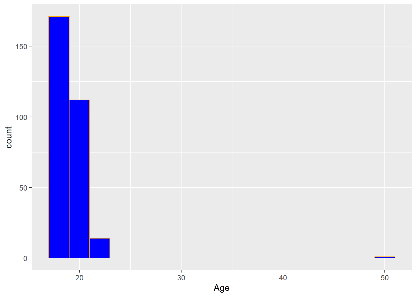
Each bar now contains two ages: the first bar contains the 18 and 19 year olds. Notice how the shape has been changed a little bit from the previous histogram with a different binwidth?
2.3.4 Density plots
Density plots are a variation of histograms, where the plot attempts to use a smooth mathematical function to approximate the shape of the histogram, and is unaffected by binwidth:
ggplot(Data,aes(x=Age))+
  geom_density()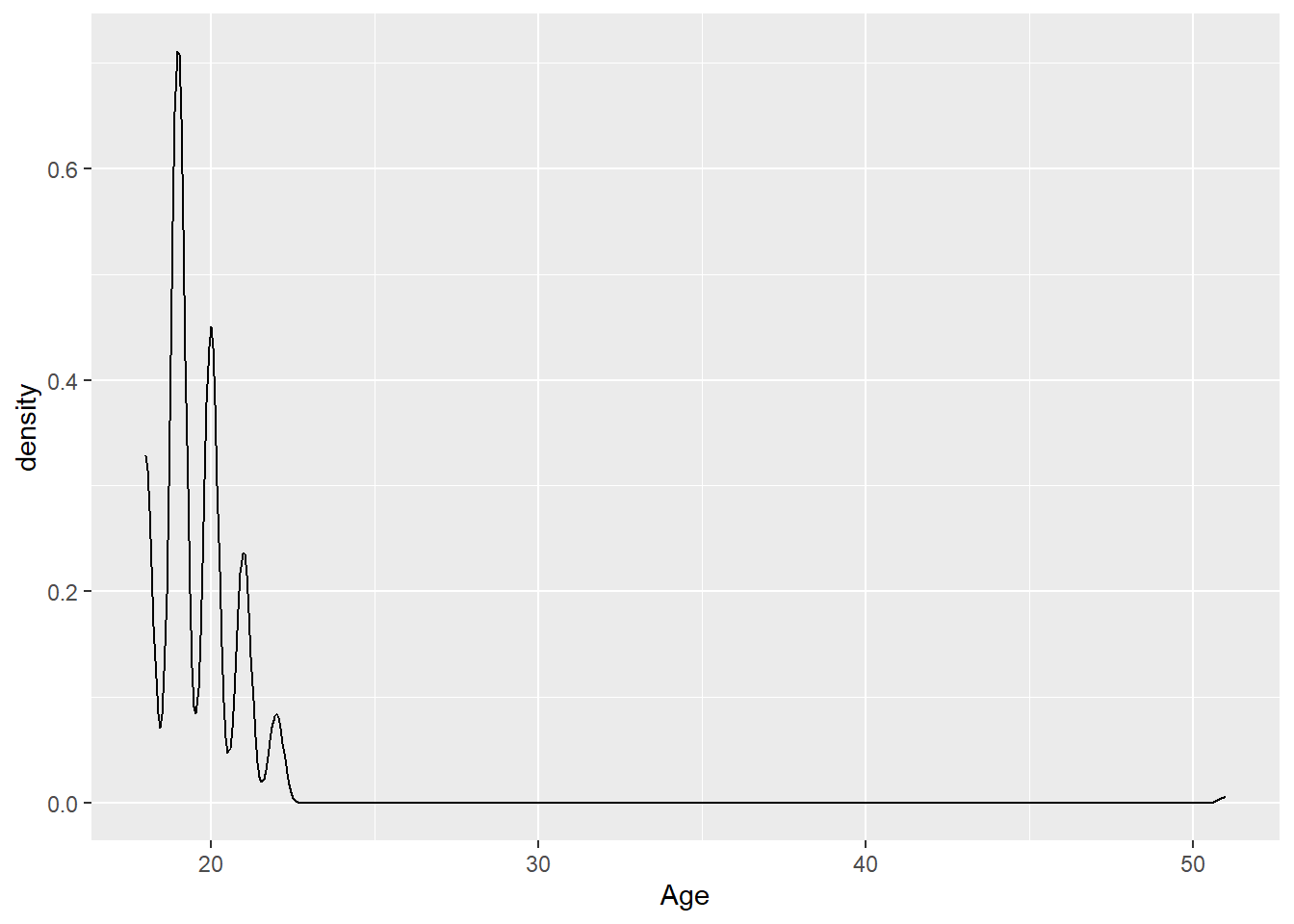
We can see that 19 and 20 year olds are the most common ages in this data. Be careful in interpreting the values on the veritical axis: these do not represent proportions. A characteristic of density plots is that the area under the plot is always one.
2.4 Bivariate Visualizations
We will now look at visualizations we can create to explore the relationship between two variables. The term bivariate means that we are looking at two variables.
We will be using a new dataset as an example, so we clear the environment:
We will be using the dataset, gapminder, from the gapminder package. Install and load the gapminder package. Also load the tidyverse package (which automatically loads the ggplot2 package):
We can take a look at the gapminder dataset:
gapminder[1:15,]## # A tibble: 15 × 6
## country continent year lifeExp pop gdpPercap
## <fct> <fct> <int> <dbl> <int> <dbl>
## 1 Afghanistan Asia 1952 28.8 8425333 779.
## 2 Afghanistan Asia 1957 30.3 9240934 821.
## 3 Afghanistan Asia 1962 32.0 10267083 853.
## 4 Afghanistan Asia 1967 34.0 11537966 836.
## 5 Afghanistan Asia 1972 36.1 13079460 740.
## 6 Afghanistan Asia 1977 38.4 14880372 786.
## 7 Afghanistan Asia 1982 39.9 12881816 978.
## 8 Afghanistan Asia 1987 40.8 13867957 852.
## 9 Afghanistan Asia 1992 41.7 16317921 649.
## 10 Afghanistan Asia 1997 41.8 22227415 635.
## 11 Afghanistan Asia 2002 42.1 25268405 727.
## 12 Afghanistan Asia 2007 43.8 31889923 975.
## 13 Albania Europe 1952 55.2 1282697 1601.
## 14 Albania Europe 1957 59.3 1476505 1942.
## 15 Albania Europe 1962 64.8 1728137 2313.Per the documentation, the variables are
countrycontinent-
year: from 1952 to 2007 in increments of 5 years -
lifeExp: life expectancy at birth, in years -
pop: population of country -
gdpPercap: GDP per capita in US dollars, adjusted for inflation
We notice that data are collected from each country across a number of different years: 1952 to 2007 in increments of five years. For this example, we will mainly focus on the data for the most recent year, 2007:
The specific visuals to use will again depend on the type of variables we are using, whether they are categorical or quantitative.
2.4.1 Compare quantitative variable across categories
2.4.1.1 Side by side boxplots
Side by side boxplots are useful to compare a quantitative variable across different classes of a categorical variable. For example, we want to compare life expectancies across the different continents in the year 2007:
ggplot(Data, aes(x=continent, y=lifeExp))+
  geom_boxplot(fill="Blue")+
  labs(x="Continent", y="Life Exp", title="Dist of Life Expectancies by Continent")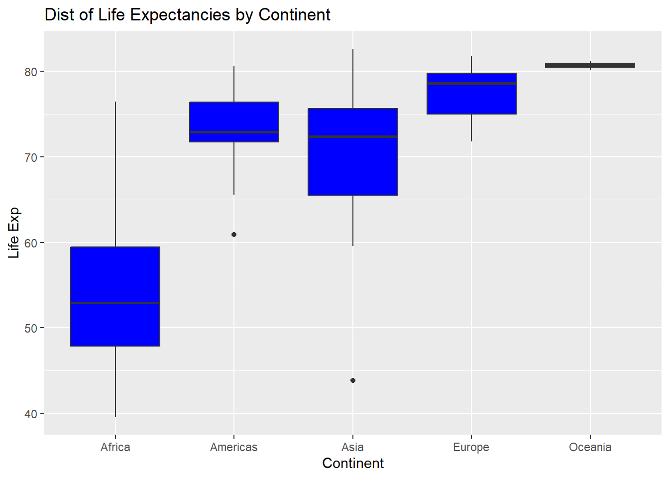
Countries in the Oceania region have long life expectancies with little variation. Comparing the Americas and Asia, the median life expectancies are similar, but the spread is larger for Asia.
2.4.1.2 Violin plots
Violin plots are an alternative to boxplots. To create these plots to compare life expectancies across the different continents in the year 2007:
ggplot(Data, aes(x=continent, y=lifeExp))+
  geom_violin()+
  labs(x="Continent", y="Life Exp", title="Dist of Life Expectancies by Continent")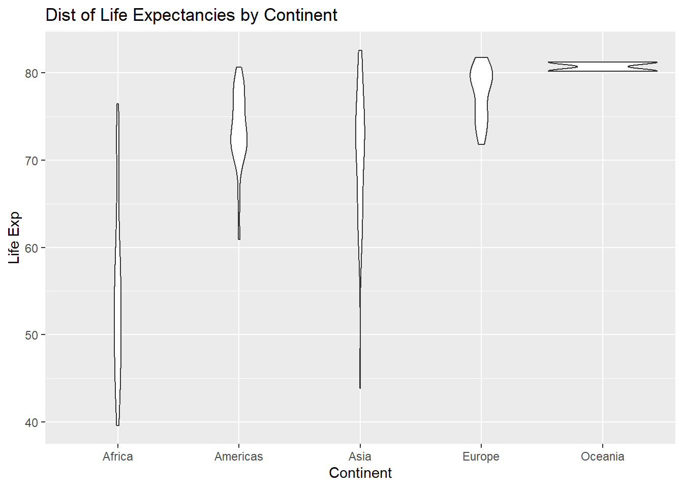
The width of the violin informs us which values are more commonly occuring. For example, look at the violin for Europe. The violin is wider at higher life expectancies, so longer life expectancies are more common in European countries.
2.4.2 Summarizing two categorical variables
For this example, we create a new binary variable called expectancy, which will be denoted as low if the life expectancy in the country is less than 70 years, and high otherwise:
2.4.2.1 Two-way tables
Suppose we want to see how expectancy varies across the continents. A two-way table can be created for produce counts when two categorical variables are involved:
mytab2<-table(Data$continent, Data$expectancy)
##continent in rows, expectancy in columns
mytab2
##
## High Low
## Africa 7 45
## Americas 22 3
## Asia 22 11
## Europe 30 0
## Oceania 2 0The first variable in table() will be placed in the rows, the second variable will be placed in the columns.
From this table, we can see that 22 countries in the Americas have high life expectancies, while 3 countries in the Americas have low life expectancies.
We may be interested in looking at the proportions, instead of counts, of countries in each continent that have high or low life expectancies. To convert this table to proportions, we can use prop.table():
prop.table(mytab2, 1) ##
## High Low
## Africa 0.1346154 0.8653846
## Americas 0.8800000 0.1200000
## Asia 0.6666667 0.3333333
## Europe 1.0000000 0.0000000
## Oceania 1.0000000 0.0000000We want proportions for each continent, so we want proportions in each row to add up to 1. Therefore, the second argument in prop.table() is 1. Enter 2 for this argument if we want the proportions in each column to add up to 1.
As before, to convert to percentages and round to 2 decimal places:
round(prop.table(mytab2, 1) * 100, 2)##
## High Low
## Africa 13.46 86.54
## Americas 88.00 12.00
## Asia 66.67 33.33
## Europe 100.00 0.00
## Oceania 100.00 0.002.4.2.2 Bar charts
A stacked bar chart can be used to display the relationship between the binary variable expectancy across continents:
ggplot(Data, aes(x=continent, fill=expectancy))+
  geom_bar(position = "stack")+
  labs(x="Continent", y="Count", title="Life Expectancies by Continent")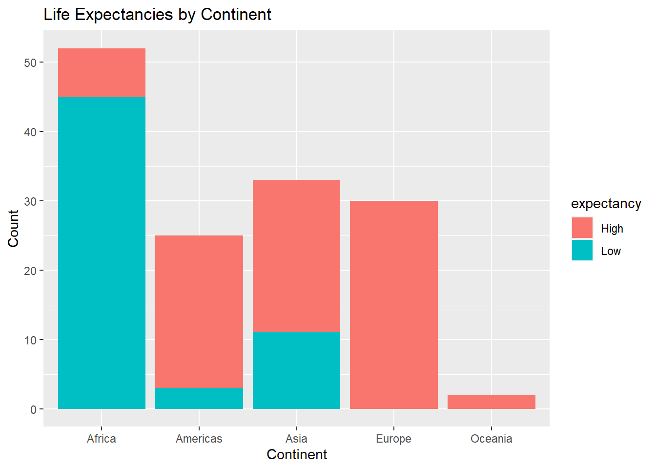
We can see how many countries exist in each continent, and how many of these countries in each continent have high or low life expectancies. For example, there are about 25 countries in the Americas with the majority having high life expectancies.
We can change the way the bar chart is displayed by changing position in geom_bar() to position = "dodge" or position = "fill", the latter being more useful for proportions instead of counts:
ggplot(Data, aes(x=continent, fill=expectancy))+
  geom_bar(position = "fill")+
  labs(x="Continent", y="Proportion",
       title="Proportion of Life Expectancies by Continent")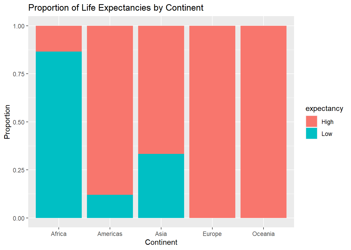
2.4.3 Summarizing two quantitative variables
2.4.3.1 Scatterplots
Scatterplots are the standard visualization when two quantitative variables are involved. To create a scatterplot for life expectancy against GDP per capita:
ggplot(Data, aes(x=gdpPercap,y=lifeExp))+
  geom_point()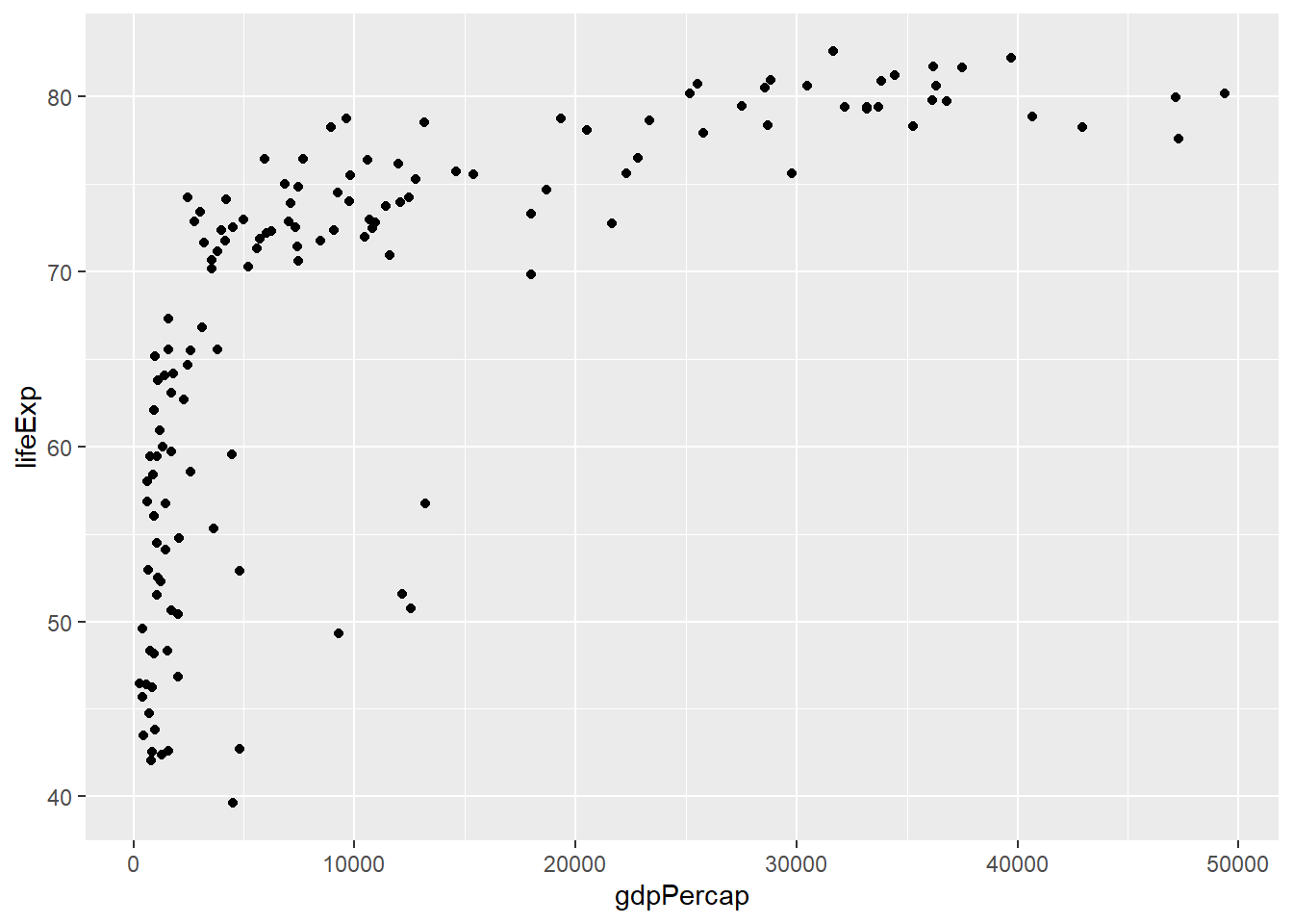
We see a curved relationship between life expectancies and GDP per capita. Countries with higher GDP per capita tend to have longer life expectancies.
When there are many observations, plots on the scatterplot may actually overlap each other. To have a sense of how many of these exist, we can add a transparency scale called alpha=0.2 inside geom_point():
ggplot(Data, aes(x=gdpPercap,y=lifeExp))+
  geom_point(alpha=0.2)+
  labs(x="GDP", y="Life Exp",
       title="Scatterplot of Life Exp against GDP")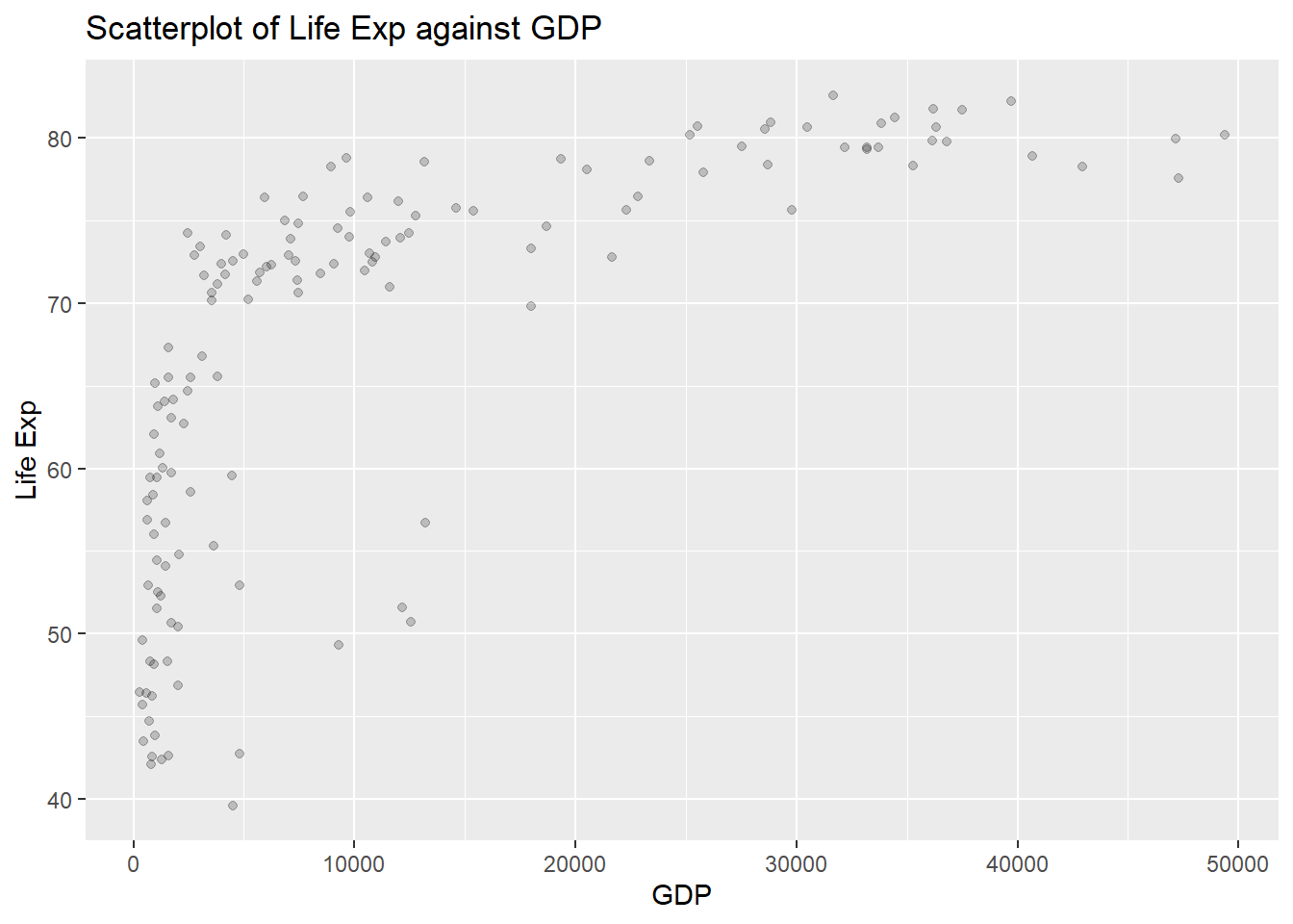
The default value for alpha is 1, which means the points are not at all transparent. The closer this value is to 0, the more transparent the points are. A darker point indicates more observations with those specific values on both variables.
2.5 Multivariate Visualizations
We will now look at visualizations we can create to explore the relationship between multiple (more than two) variables. The term multivariate means that we are looking at more than two variables.
2.5.1 Bar charts
Previously, we created a bar chart to look at how expectancy varies across the continents. Suppose we want to see how these bar graphs vary across the years, so we use the year variable as a third variable via a layer facet_wrap:
##another data frame across all years plus a binary variable
##for expectancy
Data.all<-gapminder%>%
  mutate(expectancy=ifelse(lifeExp<70,"Low","High"))

ggplot(Data.all,aes(x=continent, fill=expectancy))+
  geom_bar(position = "fill")+
  facet_wrap(~year)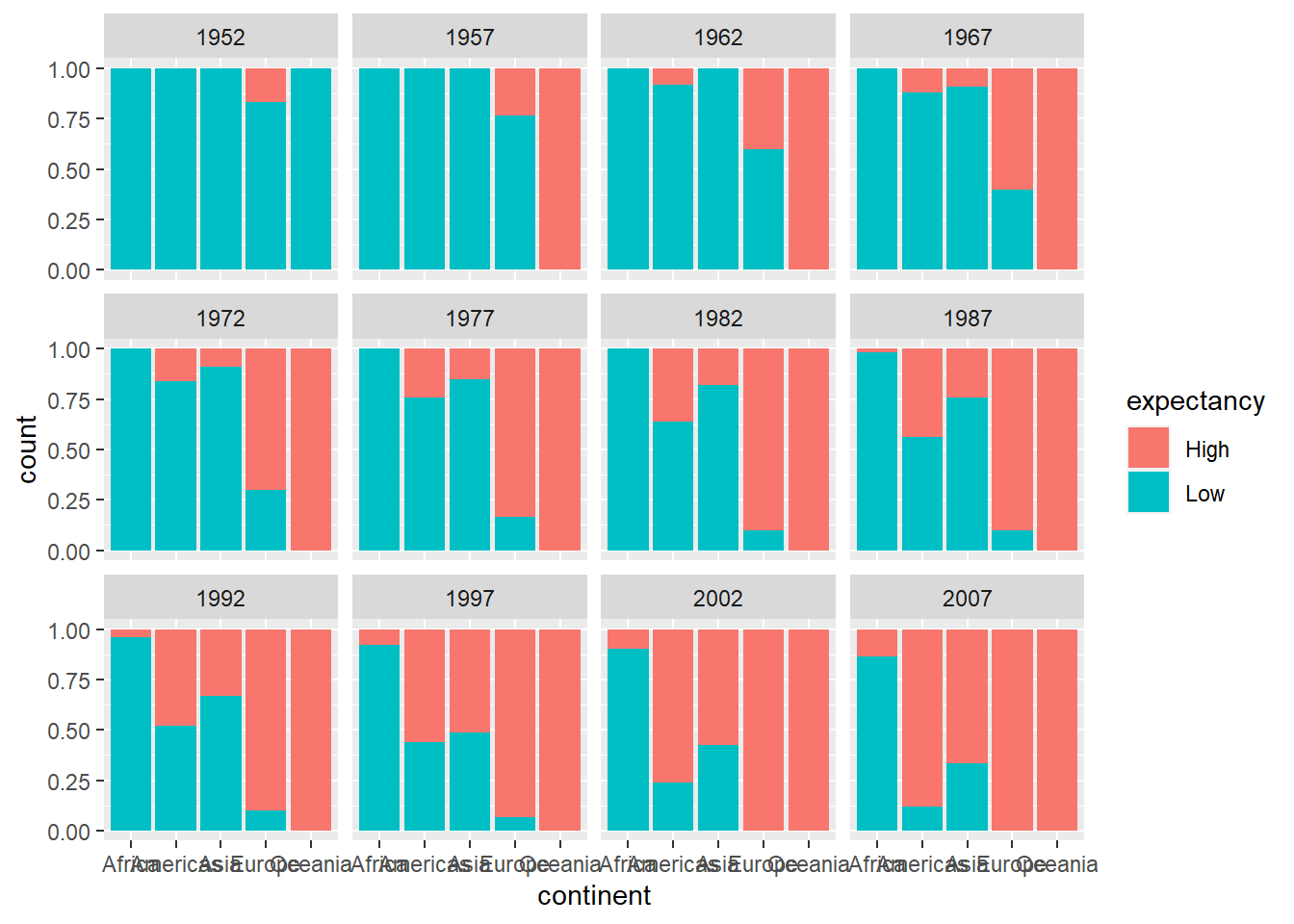
Notice that three categorical variables are summarized in this bar chart. Is there something that can be done to improve this bar chart? How would you make this improvement?
2.5.2 Scatterplots
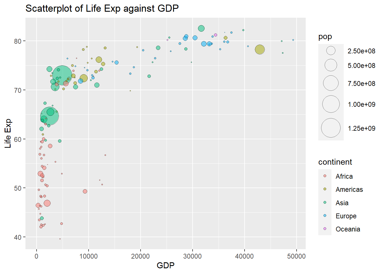
Previously, we created a scatterplot of life expectancy against GDP per capita. We can include another quantitative variable in the scatterplot, by using the size of the plots. We can use the size of the plots to denote the population of the countries. This is supplied via size in aes():
ggplot(Data, aes(x=gdpPercap, y=lifeExp, size=pop))+
  geom_point()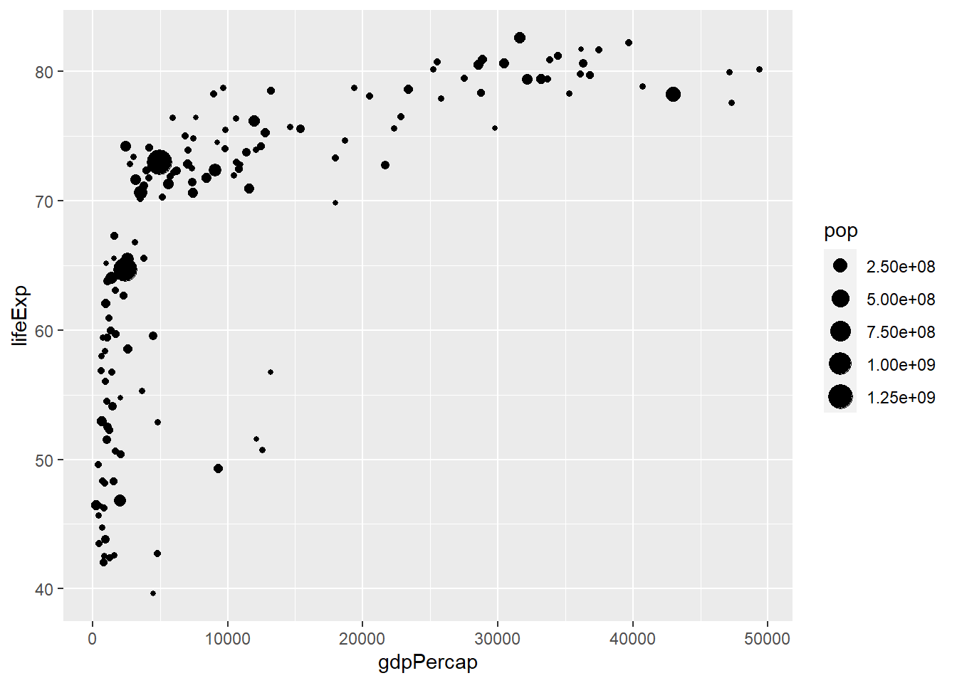
We can adjust the size of the plots by adding a layer scale_size():
ggplot(Data, aes(x=gdpPercap, y=lifeExp, size=pop))+
  geom_point()+
  scale_size(range = c(0.1,12))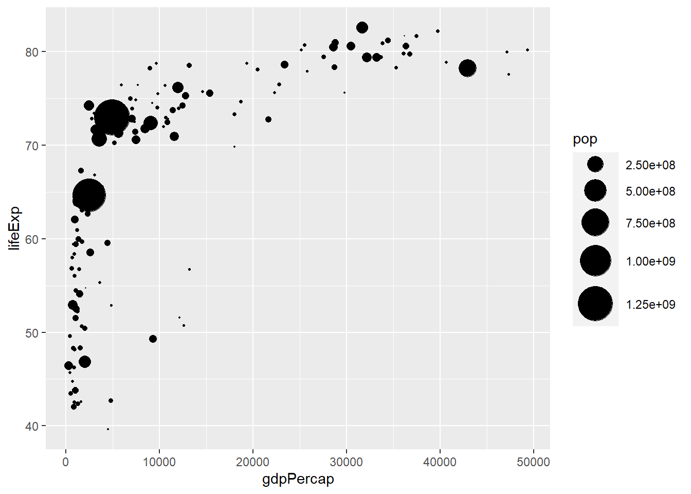
This scatterplot summarizes three quantitative variables.
We can use different-colored plots to denote which continent each point belongs to:
ggplot(Data, aes(x=gdpPercap, y=lifeExp, size=pop, color=continent))+
  geom_point()+
  scale_size(range = c(0.1,12))
This scatterplot summarizes three quantitative variables and one categorical variable.
We can adjust the plots by changing its shape and making it more translucent via shape and alpha in aes():
ggplot(Data, aes(x=gdpPercap, y=lifeExp, size=pop, fill=continent))+
  geom_point(shape=21, alpha=0.5)+
  scale_size(range = c(0.1,12))+
  labs(x="GDP", y="Life Exp", title="Scatterplot of Life Exp against GDP")