10 Analysis of Residuals in MLR
10.1 Introduction
When we compute the sample average, a data point that is much larger or smaller than the rest of the data will have a large influence on the value of the average. We usually check to see if the data point was an error (in which case the value is checked for correctness) or if there is something interesting about the data point that warrants a closer look.
Likewise, we are concerned with observations that have high leverage, are outlying, or are influential in a regression model. In this module, you will learn various measures to detect these observations. A lot of these measures are based on residuals. Generally speaking, we are most concerned with influential observations, as their presence (or removal) significantly alter the estimated regression equation.
Lastly, we will be using residuals from MLR to help us assess if any of the predictor variables need to be transformed, and if so, how to transform them, in order to meet the assumptions for MLR.
10.1.1 Terminology
You may have noticed in the earlier paragraphs that we are differentiating between observations that have high leverage, are outlying, or are influential. These observations have slightly different definitions:
- High leverage: an observation whose predictor(s) is extreme.
- Outlier: an observation whose response variable does not follow the general trend of the data.
- Influential: an observation whose presence (or removal) unduly affects any part of the regression analysis, usually in terms of unduly affecting the predicted response, the estimated coefficients, or the results from hypothesis tests and confidence intervals.
The scatterplots below in Figure 10.1 display three examples of these types of observations. We are using just one predictor for ease of visualization. In each example, there are 6 observations.
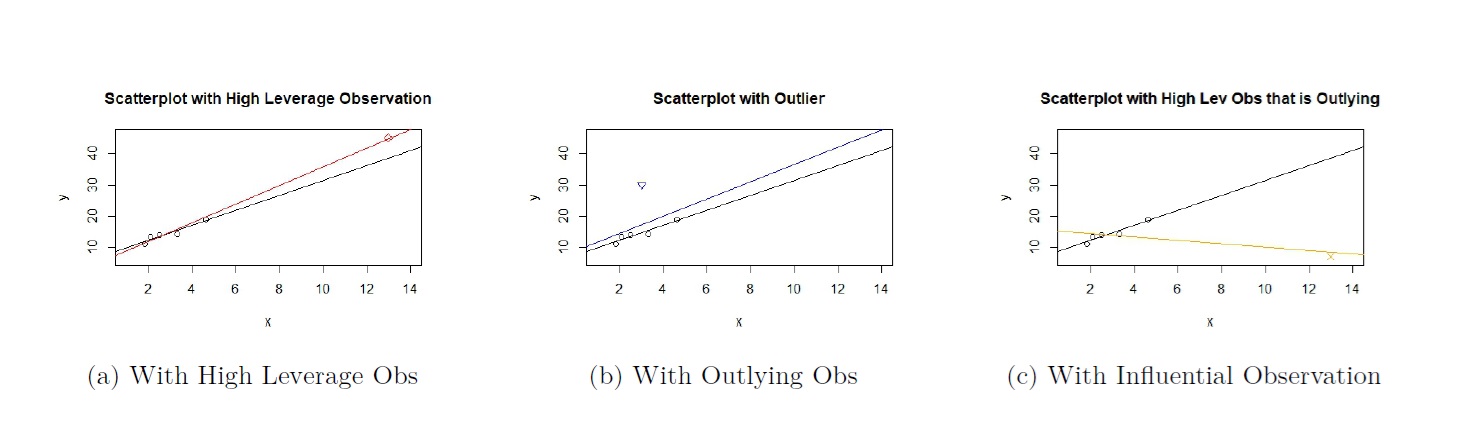
Figure 10.1: Scatterplot of Data with high leverage, Outlying, and Influential Observation
Figure 10.1(a) displays the scatterplot of an observation that is considered high leverage, denoted by the red diamond in the top right of the plot.
- The general pattern of the observations is a positive linear association between both variables. As \(x\) gets larger, \(y\) gets larger.
- The high leverage observation is a high leverage observation, as its value of \(x\) is a lot larger than the values of \(x\) for the other observations.
- The high leverage observation has a large value of \(x\), and its response has a value that is consistent with the general pattern of the observations. Therefore, it not considered an outlier.
- In the figure, two estimated regression lines are overlaid. The line in black is the regression line for the observations excluding the high leverage observation, and the line in red is the regression line when the high leverage observation is included. The lines are almost indistinguishable. Therefore, the high leverage observation is not influential.
Figure 10.1(b) displays the scatterplot of an observation that is considered an outlier, denoted by the blue triangle in the top left of the plot.
- The general pattern of the observations is a positive linear association between both variables. As \(x\) gets larger, \(y\) gets larger.
- The outlier is not a high leverage observation, as its value of \(x\) is not a lot larger or smaller than the values of \(x\) for the other observations.
- The outlier has a small value of \(x\), but its response has a value that is a lot larger than what the general pattern would suggest. Therefore, it is considered an outlier.
- In the figure, two estimated regression lines are overlaid. The line in black is the regression line for the observations excluding the outlier, and the line in blue is the regression line when the outlier is included. The lines are almost indistinguishable. Therefore, the outlier is not influential.
Figure 10.1(c) displays the scatterplot of an observation that is considered influential, denoted by the orange cross in the bottom right of the plot.
- The general pattern of the observations is a positive linear association between both variables. As \(x\) gets larger, \(y\) gets larger.
- The influential observation is also a high leverage observation, as its value of \(x\) is a lot larger than the values of \(x\) for the other observations.
- The influential observation has a large value of \(x\), but its response has a value that is a lot smaller than what the general pattern would suggest. Therefore, it is also considered an outlier.
- In the figure, two estimated regression lines are overlaid. The line in black is the regression line for the observations excluding the influential observation and the line in orange is the regression line when the influential observation is included. The lines are very different. Therefore, the observation is influential.
From Figure 10.1 , we can see that an observation that has high leverage or is outlying is not guaranteed to be influential. As a general rule , observations that have high leverage and/or are outlying have the potential to be influential. Observations that are both outlying and have high leverage are very likely to be influential.
We will now look at measures to detect these observations. These measures typically involve the residuals, or variation of residuals, from our regression.
10.2 Detecting High Leverage Observations
10.2.1 Limitation of residuals in detecting high leverage observations
An intuitive way to detect observations that have high leverage, are outlying, or are influential, is to use the residuals, defined as:
\[\begin{equation} e_i = y_i - \hat{y_i}. \tag{10.1} \end{equation}\]
However, there are certain limitations in using residuals to detect these observations. To illustrate this, let us go back to Figure 10.1. Visually, the residual is the vertical distance of an observation from the regression equation. In Figures 10.1(a) and 10.1(c), notice that the high leverage observation (red diamond) and influential observation (orange cross) are very close to the estimated regression equation in red and orange respectively. So these observations will have small residuals. However, in Figure 10.1(b) , the outlier is far away from their respective estimated regression equations, and so have a large residual. So residuals may be unable to detect high leverage observations.
Please view the associated video for a mathematical explanation for why high leverage observations are likely to have small residuals.
10.2.2 Hat matrix
Recall in MLR that the predicted response (or fitted values), can be written in matrix form as
\[\begin{equation} \boldsymbol{\hat{y}} = \boldsymbol{X\hat{\beta}}. \tag{10.2} \end{equation}\]
Using the method of least squares, the estimated coefficients can be found using
\[\begin{equation} \boldsymbol{\hat{\beta}} = \left[ \begin{array}{c} \hat{\beta}_0 \\ \hat{\beta}_1 \\ \vdots \\ \hat{\beta}_k \end{array} \right] = \left(\boldsymbol{X}^{\prime} \boldsymbol{X} \right)^{-1} \boldsymbol{X}^{\prime} \boldsymbol{y} . \tag{10.3} \end{equation}\]
Subbing (10.3) into (10.2), we have
\[\begin{eqnarray} \boldsymbol{\hat{y}} &=& \boldsymbol{X} \left(\boldsymbol{X}^{\prime} \boldsymbol{X} \right)^{-1} \boldsymbol{X}^{\prime} \boldsymbol{y} \nonumber \\ &=& \boldsymbol{Hy}, \tag{10.4} \end{eqnarray}\]
where \(\boldsymbol{H} = \boldsymbol{X (X^{\prime}X)^{-1}X^\prime}\) is called the hat matrix. If we write (10.4) in scalar form, we have
\[\begin{eqnarray*} \hat{y_1} &=& h_{11}y_1 + h_{12}y_2 + \cdots + h_{1n}y_n \nonumber \\ \hat{y_2} &=& h_{21}y_1 + h_{22}y_2 + \cdots + h_{2n}y_n \nonumber \\ &=& \vdots \nonumber \\ \hat{y_n} &=& h_{n1}y_1 + h_{n2}y_2 + \cdots + h_{nn}y_n \nonumber \end{eqnarray*}\]
where \(h_{ij}\) denotes the \((i,j)\)th entry in the hat matrix.
10.2.3 Leverage
It turns out we use the diagonal entries of the hat matrix, \(h_{ii}\), to define leverage, which measures the distance of the predictors for observation \(i\) and the center of the predictors for all observations.
Using (10.4) in scalar form, we can see that the predicted response for each observation is a linear combination of observed responses \(y_1, y_2, \cdots, y_n\). The leverage \(h_{ii}\) measures the impact that observation \(y_i\) has in predicting its response. If the leverage is high, observation \(i\) has a high impact on its prediction. Leverages have the following properties:
- \(h_{ii} = \boldsymbol{X_{i}}^{\prime} \left(\boldsymbol{X^{\prime}X} \right)^{-1} \boldsymbol{X_{i}}\).
- \(0\leq h_{ii}\leq 1\).
- \(\sum_{i=1}^n h_{ii}=p\), where \(p\) is number of parameters. Therefore the average of the leverages is \(\frac{p}{n}\).
There are various recommendations of how to determine if an observation has high leverage. We will use \(h_{ii} > \frac{2p}{n}\) as a general rule, or twice the average of the leverages. Note that we should use this as a guide, and remember that the higher the leverage, the further away the predictors for observation \(i\) are from the center of the predictors for all observations.
Let us find the residual and leverage of the observations that make up the scatterplot in Figure 10.1(a). Note that there are 6 observations, and the high leverage observation has index 6. First, we take a look at the residuals. The absolute values of the residuals are reported below and are sorted in increasing order:
##         5         6         2         4         3         1
## 0.1561530 0.3052037 0.5633585 0.7479269 1.3792798 1.4147975
Notice that the high leverage observation has a residual with absolute value of 0.3052. There are a few other observations with larger residuals. So residuals will fail to identify observation 6 has having high leverage. We now look at leverages, reported below and sorted in increasing order:
##leverages, sorted in increasing order
sort(lm.influence(result.lev)$hat)
## 4 3 2 1 5 6
## 0.1667478 0.1839964 0.2132494 0.2345507 0.2492167 0.9522391
##criteria
p<-2
n<-dim(Data.lev)[1]
2*p/n
## [1] 0.6666667Note that observation 6 has leverage of 0.9522, which is a lot larger relative to the leverages of the other five observations. Indeed, it is larger than the suggested criteria of \(\frac{2p}{n} = 0.6667\). We can see how leverage, and not residuals, is measure that should be used to identify high leverage observations.
10.3 Analysis of Residuals: Detecting Outliers
In the previous section, we noted that residuals should not be used to detect high leverage observations. Another limitation is that the numerical value of residuals is based on the unit of the response variable. So what makes a residual large depends on the unit of the response variable. In view of this limitation, we consider standardizing residuals to make them unitless. There are a few ways of standardizing residuals, some of which are useful in detecting outliers.
10.3.1 Standardized residuals
Recall that the errors in our regression model, denoted by \(\epsilon\), have variance denoted by \(\sigma^2\), which in turn is estimated by the \(MS_{res} = \frac{\sum(y_i - \hat{y_i})^2}{n-p}\). Therefore, the standardized residuals, \(d_i\), are found by
\[\begin{equation} d_{i} = \frac{e_i}{\sqrt{MS_{res}}}. \tag{10.5} \end{equation}\]
We are dividing the residuals, \(e_i\), by the standard error of the errors.
10.3.2 Studentized residuals
However, \(MS_{res}\) estimates the variance of the errors, not the residuals. It turns out the variance of the residuals is
\[\begin{equation} Var (e_i) = MS_{res}(1-h_{ii}). \tag{10.6} \end{equation}\]
So we should be standardizing the residual by using the standard error of the residuals instead, and we get studentized residuals
\[\begin{equation} r_i = \frac{e_i}{\sqrt{MS_{res}(1-h_{ii})}}. \tag{10.7} \end{equation}\]
Let us find the residuals and studentized residuals for the observations given in Figure 10.1(b). Note that there are 6 observations, and the outlying observation has index 6. First, we take a look at the residuals. The absolute values of the residuals are reported below and are sorted in increasing order:
##         1         2         4         5         3         6
##  1.259631  2.007224  2.796350  2.892751  3.754347 12.710304
Residuals identify the outlying observation, index 6. However, the numerical values for these residuals depend on the unit of the response variable, so it can be hard to ascertain what value of residual is considered large. So we can look at the studentized residuals instead:
##absolute value of studentized residuals, sorted in increasing order
sort(abs(rstandard(result.out)))
## 1 2 5 3 4 6
## 0.2134751 0.3186190 0.5258773 0.5970578 0.8023354 1.9850133The studentized residual estimates how many standard deviations its predicted response is from the actual response. So the predicted response for the outlying observation is estimated to be 2 standard deviations away from its true value. Typically, studentized residuals with magnitude larger than 2 are flagged. In comparison with the other five studentized residuals, the outlier has a studentized residual quite a lot larger than the others.
Let us take a look at the studentized residual for the observations shown in Fig 10.1(c). Again, note that there are 6 observations, and the influential observation has index 6.
##         2         3         1         5         4         6
## 0.1180102 0.1618282 0.3298582 1.1348254 1.8125713 1.9409466
The value of the studentized residual for the influential observation is 1.9409, pretty close to 2. However, notice that in relationship with the other studentized residuals, it is not a lot larger. So we may not deem this observation as outlying, or deem that observation 4 is also outlying, which is incorrect. This can happen when the observation is influential. So, we see some limitation in using studentized residuals to flag outliers. We will further refine the residual so we can identify outliers more clearly.
10.3.3 Deleted residuals
We have seen an example in the previous subsection where an influential observation that is also outlying has studentized residuals that are not a lot larger than the other studentized residuals. This is because if the observation also has high leverage (for example in Fig 10.1(c)), the observation is likely to pull the estimated regression equation towards itself, resulting in a small residual and studentized residual that is not a lot larger than the rest.
To address this issue, we remove the observation in question from estimating the regression model, so the observation will not pull the regression equation towards itself.
We can use the deleted residual to measure this. It is defined as the difference in the value of the actual response for an observation and its prediction when the observation is not used to estimate the regression equation. The deleted residual for observation \(i\) is denoted as
\[\begin{equation} e_{(i)}=y_i-\hat{y}_{i(i)}. \tag{10.8} \end{equation}\]
There are two values in the subscript for \(\hat{y}_{i(i)}\). The value outside the subscript denotes the observation we are making the prediction for. The subscript surrounded by the parenthesis indicates the observation has been removed from estimating the regression equation.
Let us use Figure 10.1(c) as an example to demonstrate. The influential observation is denoted by the orange cross, and is observation 6:
- \(y_6\) denotes the value of the response variable for this observation.
- \(\hat{y}_{6(6)}\) denotes the predicted response for this observation, if it was removed from estimating the regression equation. Visually, on Figure 10.1(c), \(\hat{y}_{6(6)}\) is the predicted response based on the black regression line, since the black regression line was estimated without observation 6.
- \(e_{(6)}\) denotes the vertical distance of observation 6 (the orange cross) from the black regression line.
A mathematically equivalent form for (10.8) is
\[\begin{equation} e_{(i)} = \frac{e_i}{1-h_{ii}}. \tag{10.9} \end{equation}\]
Note that the larger \(h_{ii}\) is, the deleted residual is larger compared to the residual. Thus deleted residuals will at times identify outliers when residuals would not, especially if it has high leverage.
Just like residuals, deleted residuals depend on the unit of the response variable, so we should scale deleted residuals.
Please view the associated video for more explanation behind deleted residuals.
10.3.4 Externally studentized residuals
We can scale the deleted residuals to obtain residuals, which are
\[\begin{equation} t_i = \frac{e_i}{\sqrt{MS_{res(i)}(1-h_{ii})}}. \tag{10.10} \end{equation}\]
Note that \(MS_{res(i)}\) denotes the \(MS_{res}\) of the regression model that is estimated without observation \(i\). From a computational standpoint, calculating \(t_i\)s this way requires us to fit \(n\) regression models, in order to find \(MS_{res(i)}\) for each \(t_i\).
A computationally more efficient to compute \(t_i\) is
\[\begin{equation} t_i = e_i\left[\frac{n-1-p}{SS_{res}(1-h_{ii})-e_i^2}\right]^{1/2}. \tag{10.11} \end{equation}\]
The formulation in (10.11) only requires us to fit one estimated regression model. The reason why (10.10) and (10.11) are equivalent is based on the relationship between \(MS_{res}\) and \(MS_{res(i)}\):
\[\begin{equation} (n-p)MS_{res}=(n-1-p)MS_{res(i)} + \frac{e_i^2}{(1-h_{ii})}. \tag{10.12} \end{equation}\]
Let us take a look at the externally studentized residuals for the scatterplots shown in in Figures 10.1(b) and 10.1(c). Again, we are sorting them based on increasing order based on absolute values:
##          1          2          5          3          4          6
## 0.1859371 0.2795018 0.4720327 0.5417717 0.7585583 14.0687652## 2 3 1 5 4 6
## 0.1023782 0.1406084 0.2896319 1.1935239 3.7138867 6.9686966Notice how the externally studentized residuals for observation 6 in both plots are a lot larger than for the other observations. It is now a lot more obvious that these are outliers, compared to using studentized residuals earlier on.
Generally speaking, \(|t_i| > 3\) is a decent rule to use to flag outliers. But this rule should be used in relation with all the \(t_i\)s.
We have covered measures to detect high leverage observations and outliers. These observations usually have something interesting that make them “stand out” from the other observations. But they are not necessarily influential in a regression setting.
10.4 Influential Observations
In a regression setting, an observation is influential if its presence, or removal, drastically alters the regression analysis. We usually quantify this alteration in terms of how much the predicted response and / or the estimated coefficients change with and without the observation in question. Generally speaking, observations that have high leverage and are outlying have the most potential to be influential. As an example from Figure 10.1, we see that the estimated regression line is drastically altered only in Figure 10.1(c).
10.4.1 DFBETAs
We can look at how the estimated coefficients change when the observation in question is removed from estimating the model. This is the motivation behind DFBETAs:
\[\begin{equation} DFBETAS_{j,i} = \frac{\hat{\beta}_j-\hat{\beta}_{j(i)}} {\sqrt{MS_{res(i)}c_{jj}}} \tag{10.13} \end{equation}\]
where \(c_{jj}\) is the \(j\)th diagonal element of \(\left(\boldsymbol{X^{\prime}X}\right)^{-1}\), since \(Var(\boldsymbol{\hat{\beta}}) = \sigma^2 \left(\boldsymbol{X^{\prime}X}\right)^{-1}\).
Notice there are two subscripts in \(DFBETA_{j,i}\). The first subscript denotes the coefficient, and the second denotes the observation. The numerator in (10.13) measures the change in the estimated coefficient, and then we standardize this change by dividing with its standard error.
A few other things to note with (10.13):
- The sign for \(DFBETAS_{j,i}\) indicates whether excluding an observation leads to an increase or decrease in that estimated regression coefficient.
- \(DFBETAS\) can be interpreted as the number of standard errors the estimated coefficient changes when observation \(i\) is removed from building the model.
- Suggested rule for influential observation: \(|(\mbox{DFBETAS})_{j,i}|>\frac{2}{\sqrt{n}}\). Again, this should be used as a guide, and in conjunction with the values of \(DFBETAS\) for all coefficients and observations.
Let us go back to the scatterplot in Fig 10.1(c) and compute the \(DFBETAs\):
dfbetas(result.both)## (Intercept) x
## 1 -0.15341916 0.08625257
## 2 -0.04957068 0.02491157
## 3 0.05689633 -0.02049090
## 4 1.05250538 0.03665073
## 5 -0.66636733 0.39576044
## 6 13.00009691 -28.26234465Notice the information is presented in a \(6 \times 2\) matrix. The dimension will always by \(n \times p\), where each row index corresponds to the observation, and the column index corresponds to the coefficient. The value in row 6 column 1 informs us that removing observation 6 from estimating the model will change \(\hat{\beta_0}\) by about 13 standard errors, and change \(\hat{\beta_1}\) by about 28 standard errors. In comparison to the \(DFBETAS\) for other observations, these values are huge, so we flag observation 6 as influential.
Checking in with the suggested rule for influential observations:
##criteria for DFBETAs
2/sqrt(n)
## [1] 0.8164966So clearly observation 6 is influential, since its \(DFBETAs\) are much larger than 0.8165.
10.4.2 DFFITs
Another measure for influential observations is based on the change in the predicted response when the model is estimated with and without the observation in question. One such measure is \(DFFITs\), defined as
\[\begin{eqnarray} DFFITS_i &=& \frac{\hat{y}_i-\hat{y}_{i(i)}}{\sqrt{S^2_{(i)}h_{ii}}} \tag{10.14} \\ &=& t_i\left(\frac{h_{ii}}{1-h_{ii}}\right)^{1/2}. \tag{10.15} \end{eqnarray}\]
A few notes about \(DFFITs\):
- Using (10.14), \(DFFITs\) can be interpreted as the number of standard errors \(\hat{y}_i\) changes if observation \(i\) is removed when estimating the model.
- \(DFFITs\) measures the influence of observation \(i\) on its own fitted value.
- As a guide, \(\left|DFFITS_i\right| > 2\sqrt{p/n}\) considered influential. Again, this should be used in conjunction with the \(DFFITs\) for all observations.
- Using (10.15), we can see that observations with high leverage and are outlying are likely to have high values for \(DFFITs\).
Let us go back to the scatterplot in Fig 10.1(c) and compute the \(DFFITs\):
dffits(result.both)## 1 2 3 4 5 6
## -0.16032698 -0.05330067 0.06676822 1.66138579 -0.68764196 -31.11630918The \(DFFITs\) for observation 6 is around -31, which is a lot larger in magnitude compared to the other \(DFFITs\). We can safely say that it is influential, since its presence or removal changes its predicted response by about 31 standard errors.
Checking in with the suggested rule for influential observations:
##criteria for DFFITs
2*sqrt(p/n)
## [1] 1.154701The magnitude of \(DFFITS_6\) is clearly larger than this criteria, so it is influential based on this criteria. Interestingly, the criteria will also flag observation 4 as influential, even though visually it does not appear to be, based on Fig 10.1(c).
10.4.3 Cook’s distance
Another measure that is motivated by the change in fitted values is Cook’s Distance
\[\begin{eqnarray} D_i &=& \frac{\left( \boldsymbol{\hat{y}} - \boldsymbol{\hat{y}_{(i)}} \right)^{\prime} \left( \boldsymbol{\hat{y}} - \boldsymbol{\hat{y}_{(i)}} \right)}{p MS_{res}} \tag{10.16} \\ &=& \frac{r_i^2}{p}\frac{h_{ii}}{1-h_{ii}}. \tag{10.17} \end{eqnarray}\]
\(\boldsymbol{\hat{y}_{(i)}}\) denotes the vector of fitted values with observation \(i\) removed. A few comments about Cook’s distance:
From (10.16), we can see that the numerator of Cook’s distance measures the Squared Euclidean distance between the vector of fitted values with all observations, \(\boldsymbol{\hat{y}}\), and the vector of fitted values with observation \(i\) removed, \(\boldsymbol{\hat{y}_{(i)}}\). So it measures how the fitted values for all observations change, if observation \(i\) is removed. This is unlike \(DFFITs\), which only measures the change in fitted value for observation \(i\).
From (10.17), we can see that observations with high leverage and that are outlying are likely to have large Cook’s distances.
A suggested guideline is that observations with Cook’s distance larger than 1 will be flagged as influential.
Let us go back to the scatterplot in Fig 10.1(c) and compute the Cook’s distances:
cooks.distance(result.both)## 1 2 3 4 5 6
## 0.016670353 0.001887380 0.002952539 0.328733436 0.213742357 37.555213339The Cook’s distance for observation 6 is about 37.5552, which is a lot larger than 1, and a lot larger than the Cook’s distance for other observations. So we flag it as an influential observation.
10.4.4 Some comments about flagged observations
A tendency is to remove observations that have been flagged using any of the measures in this module. Be EXTREMELY CAREFUL with deleting such observations. Many times, these observations provide interesting case studies and should always be identified and discussed. Something is making them different from the other observations.
A few other comments:
- Do not get too caught up with the guidelines for flagging these observations. Use these guidelines in relation to the values for all observations as well. Also use context to guide you.
- If it is clear that these observations were data entry errors, fix them.
- If these observations represent unusual circumstances that do not meet the objectives of the study, or if there is something fundamentally wrong with the observation, you may delete them, but make sure to clearly explain why. For example, you may be measuring the weights of newborn babies, but a 20 week old baby’s weight was entered into the study. Clearly, the 20 week old is not part of the study, so we can remove that baby’s weight.
- Sometimes, these observations are flagged due to a predictor or response variable being a lot larger than the rest. Log transforming the corresponding variable can help make the value a lot closer to the rest.
- Fit the model with and without the influential observations and see how differently the models answer our questions of interest.
- You should always address the removal of any observations in your report. Also provide the justifications for their removal.
10.5 Partial Regression Plots
Another use of residuals is to use them to inform us if we need to transform predictor variables in MLR.
In SLR, we learned how to use scatterplots and residual plots to assess the various regression assumptions, and how to transform the predictor or response variable as needed. For MLR, we still use residual plots in the same way to assess a couple of the regression assumptions:
- The errors have mean 0.
- The errors have constant variance.
A challenge in MLR is that if assumption 1 is violated, we know we can remedy this by transforming at least one of the predictors, but we cannot use scatterplots to decide which predictor to transform, and how to transform. The main reason is that scatterplots only take into account one of the predictors and ignoring the other predictors, whereas MLR fits all the predictors into the model at the same time.
A partial regression plot illustrates the marginal effect of adding a predictor when the others are already in the model. We can use partial regression plots to decide if a predictor should be added into our MLR model, or if needed, how to transform the predictor. Note that there are a number of other commonly used names for partial regression plots such as added variable plots and marginal effects plots.
Partial regression plots are created in the following manner. Suppose we have predictors \(x_1, x_2, \cdots, x_{k-1}\) in the model, and want to decide if we need to add, drop, or transform predictor \(x_k\):
- We regress \(y\) against \(x_1, x_2, \cdots, x_{k-1}\) and obtain the residuals. Denote these residuals by \(e(y|x_1, x_2, \cdots, x_{k-1})\).
- We regress the predictor in question, \(x_k\), against the other predictors in the model and obtain the residuals. Denote these residuals by \(e(x_k|x_1, x_2, \cdots, x_{k-1})\).
- Then, we plot \(e(x_k|x_1, x_2, \cdots, x_{k-1})\) against \(e(y|x_1, x_2, \cdots, x_{k-1})\). This plot is the partial regression plot of \(x_k\).
Usually, we assess the partial regression plot for the following patterns: (1) Random horizontal band (no pattern); or (2) Linear pattern; or (3) Nonlinear pattern.
- If we see a random horizontal band, it means we can drop \(x_k\) from the model.
- If we see a linear pattern, keep \(x_k\) as in the model without transformation.
- If we see a nonlinear pattern, we will need \(x_k\) as a predictor, but it needs to be transformed. We use the shape of the partial regression plot to aid us in transforming the predictor.
Some properties of partial regression plots:
- The estimated intercept is 0.
- The estimated slope is the estimated coefficient of \(x_k\) in the model with \(x_1, x_2, \cdots, x_{k}\) as predictors.
Let us take a look at an example based on simulated data. For simplicity, we have a response variable and two predictors, \(x_1, x_2\). We consider a MLR model here, and create the corresponding diagnostic plots:
##create dataframe
Data<-data.frame(x1,x2,y)

##MLR
result<-lm(y~x1+x2, data=Data)

##residual plot
par(mfrow=c(2,2))
plot(result)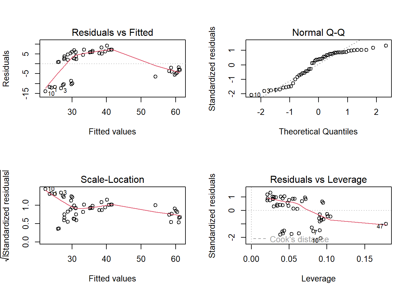
Looking at the residual plot at the top left, the assumption that the variance of the errors is constant is reasonably met, as the vertical spread of the residuals is similar throughout the plot. Assumption 1, that the errors have mean 0, is not met. We can see a curved pattern in the residuals and they are not evenly scattered across the horizontal axis. For small and large values on the horizontal axis, the residuals are almost exclusively negative and so do not have a mean of 0. For moderate values on the horizontal axis, the residuals are almost exclusively positive and so do not have a mean of 0.
So we know that we need to transform at least one predictor, since assumption 1 is not met. However, the residual plot does not inform us which predictor to transform, and how. So we create partial regression plots:
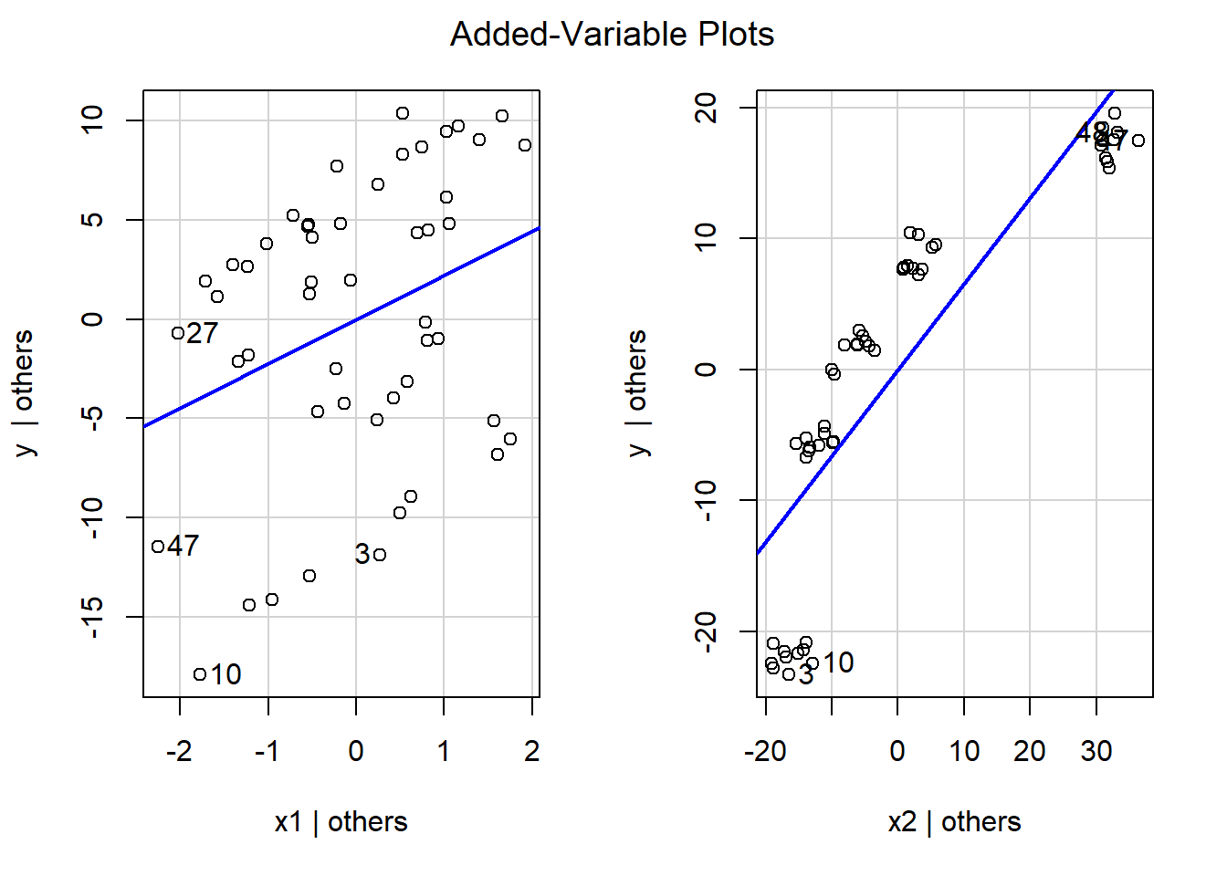
The first plot on the left is the partial regression plot for \(x_1\), and the second plot on the right is the partial regression plot for \(x_2\).
- Based on the partial regression plot for \(x_1\), we see a clear linear pattern, as the plots are evenly scattered across the blue line. So \(x_1\) does not need to be transformed.
- Based on the partial regression plot for \(x_2\), we see a non linear pattern. For values on the horizontal axis that are small and large, the plots are all below the blue line; however, for values on the horizontal axis that are moderate, the plots are all above the blue line. The shape of this pattern resembles a logarithmic function, we will log transform \(x_2\), refit the regression, and reassess the residual plot.
##need to transform x2
x2star<-log(x2)
Data<-data.frame(Data,x2star)

##regress using x2star
result2<-lm(y~x1+x2star, data=Data)

##diagnostic plots
par(mfrow=c(2,2))
plot(result2)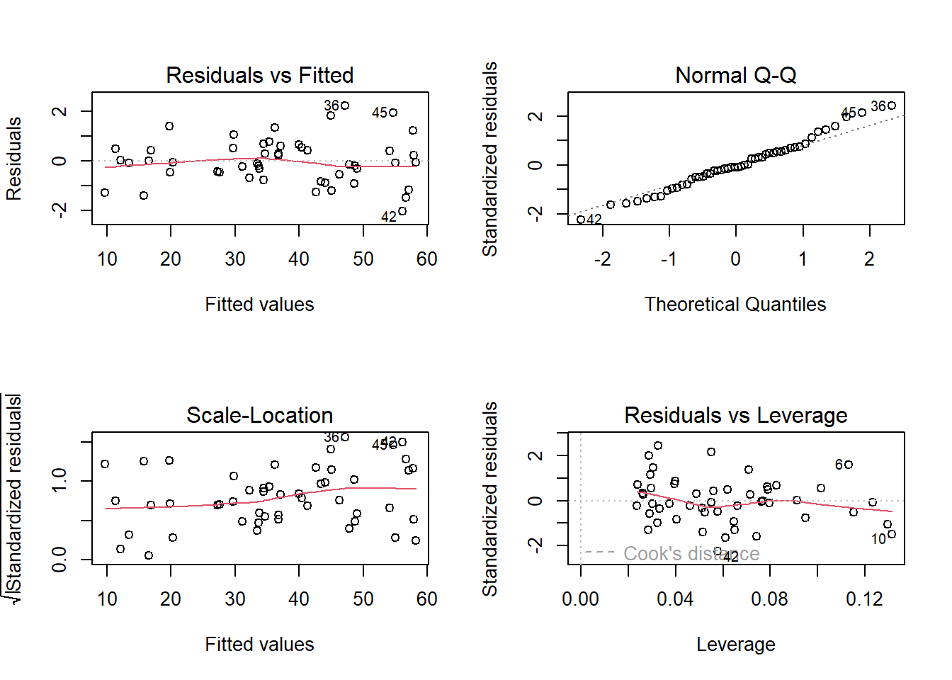
The residual plot now looks a lot more reasonable. The residuals are evenly scattered across the horizontal axis with constant vertical spread, so assumptions 1 and 2 are met. The transformation of \(x_2\) was successful.
Out of curiosity, we can look at the resulting partial regression plots:
##partial regression plots
car::avPlots(result2)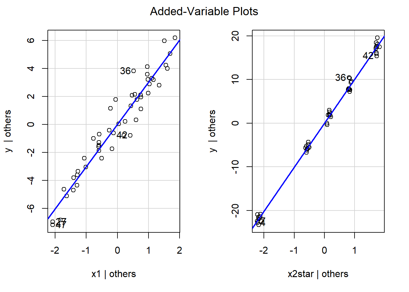
It is not surprising to see that for both partial regression plots, the plots are evenly scattered across the blue lines. In fact, the slopes of the blue lines will be the same value as the corresponding estimated coefficient:
result2##
## Call:
## lm(formula = y ~ x1 + x2star, data = Data)
##
## Coefficients:
## (Intercept) x1 x2star
## 5.898 3.014 10.072The estimated coefficients for \(x_1\) and \(x_2\) in the MLR are about 3 and 10 respectively, which match with what we see in their corresponding partial regression plots.
10.6 R Tutorial
For this tutorial, we will go over a data set from the mid 1980s that contains data on the mean teacher pay, mean spending in public schools, for each state.
We want to assess how teacher pay (PAY) is related to spending in public schools (SPEND), while controlling for geographic region (AREA). The geographic regions are North (coded 1), South (coded 2), and West (coded 3).
Load the various packages that we need for visualizations and assessing regression assumptions. Also download the data file, teacher_pay.txt:
library(ggplot2) ##for visuals
library(MASS) ##for boxcox
Data<-read.table("teacher_pay.txt", header=TRUE, sep="")
Notice AREA is recorded with integers, so we need to convert it to a factor, and give descriptive names to the regions.
class(Data$AREA) ##notice its integer. Need to convert to factor## [1] "integer"## [1] "1" "2" "3"We create some visualizations to see if we can spot potential outliers, high leverage, and / or influential observations. We create a scatterplot of the two quantitative variables: PAY against SPEND, with different colors to denote the three regions. This dataframe actually provides the names of the state for each row, so we can overlay the names of the states on the scatterplot via the layer geom_text():
ggplot2::ggplot(Data, aes(x=SPEND, y=PAY, color=AREA))+
  geom_point()+
  geom_smooth(method=lm, se=FALSE)+
  labs(title="Scatterplot of Pay against Expenditure, by Area")+
  geom_text(label=rownames(Data))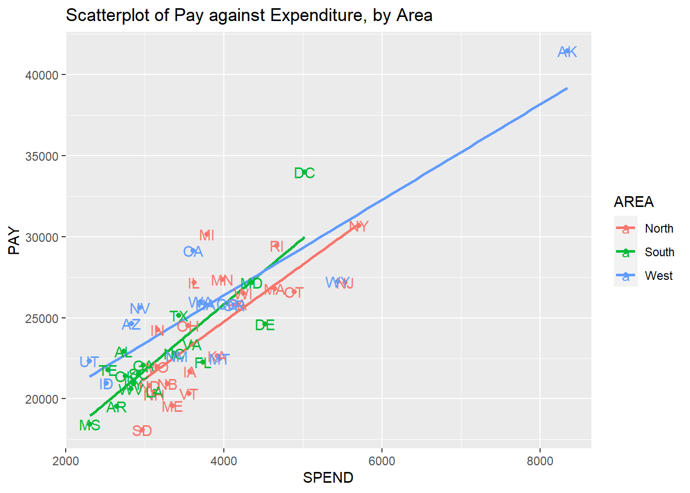
Based on this scatterplots, we note the following:
- Within each geographic region, teacher pay has a positive linear association with spending in public schools.
- The slopes are not all parallel, so the association between teacher pay and spending in public schools varies across geographic regions.
- Alaska stands out, as its teacher pay and spending in public schools are a lot higher than the rest of the states in the West.
Model fitting and Diagnostics
Given what we noted above, we fit a model with interaction.
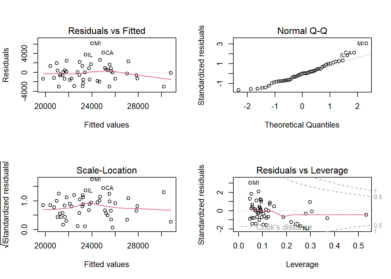
result<-lm(PAY~AREA*SPEND, data=Data)We take a look at the residual plot to assess regression assumptions:
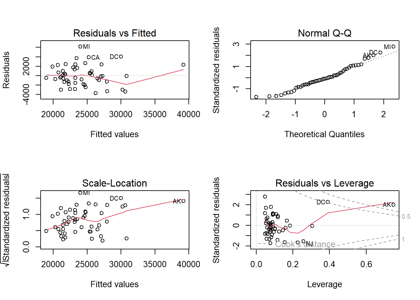
Look at the residuals vs leverage plot (bottom right). This plot identifies Alaska as having Cook’s distance greater than 1, and DC has Cook’s distance greater than 0.5. So based on Cook’s distance we have one influential observation: Alaska. Which is not terribly surprising as we saw in the scatterplots above that it was clearly a high leverage observation.
Looking at the scale-location plot (bottom left), it appears the variance of the standardized residuals could be increasing. However, this could be unduly influenced by Alaska being influential and high leverage.
The residual plot looks fine: they are generally evenly scattered across the horizontal axis with constant vertical variation.
We take a look at the Box Cox plot.
MASS::boxcox(result) 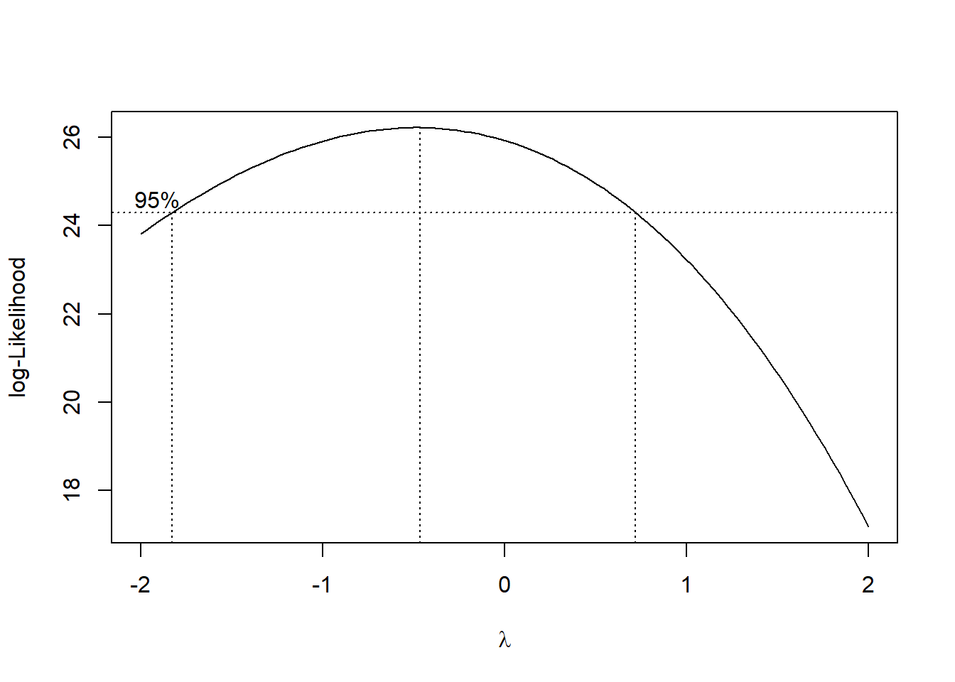
Notice that \(\lambda=1\) is slightly outside the 95% CI. For now, we will not transform the response variable, given this, and that the residual plot looks fine.
Detecting high leverage observations and outliers
We calculate the leverages and externally studentized residuals. Leverages are found by extracting the component called hat after the function lm.influence() is used on an object created by lm(). The function rstudent() is used to obtain the externally studentized residuals of an object created by lm():
hii<-lm.influence(result)$hat ##leverages
ext.student<-rstudent(result) ##ext studentized res
n<-nrow(Data)
p<-6
And compare them with relevant criteria.
hii[hii>2*p/n]## NY NJ DC AK
## 0.3053842 0.2581918 0.3912344 0.74872424 states have high leverage. Alaska and DC being flagged are not surprising given the residual vs leverage plot earlier. Let us sort the leverages:
sort(hii)## KA MN MI PA IL IA WI
## 0.04763314 0.04814049 0.04872688 0.05324797 0.05377504 0.05632986 0.05706558
## VT OH NC LA TX GA VA
## 0.05707857 0.05746450 0.05973863 0.06129159 0.06143055 0.06827941 0.06996579
## ME SC MT CO NB HA KY
## 0.07183791 0.07252628 0.07694962 0.07743972 0.07745833 0.07772608 0.07819689
## OR WA CA WV FL NM OK
## 0.07834563 0.07849313 0.08023754 0.08125084 0.08156618 0.08607902 0.08859618
## MA IN AL MO RI NH AR
## 0.09089505 0.09092285 0.09127547 0.09139123 0.09410454 0.09633746 0.10245416
## ND NV SD AZ TE CT ID
## 0.10338837 0.11028362 0.11624741 0.11760852 0.11879029 0.12437883 0.14499945
## WY MS UT MD DE NJ NY
## 0.15610645 0.16134343 0.16700704 0.18479604 0.22726386 0.25819177 0.30538424
## DC AK
## 0.39123441 0.74872418Notice that NJ’s leverage is not that much higher than most of the states, even though it was flagged earlier. Next, we use externally studentized residuals to flag outliers:
ext.student[abs(ext.student)>3]## MI
## 3.019843Michigan is flagged as an outlier. Looking back at the scatterplot, we notice it’s response is a quite a bit larger than what the estimated regression equation would predict. We take a look at the externally studentized residuals by sorting them:
##         MD         SC         HA         NY         MO         MA         KY
## 0.03644196 0.05262498 0.06210089 0.06476159 0.08128973 0.10835326 0.10929606
##         GA         WV         NC         PA         WA         MS         CO
## 0.17250321 0.19257076 0.21152962 0.21756552 0.22063591 0.24283511 0.28475162
##         ND         OK         AR         VA         WI         OR         UT
## 0.29501349 0.29572399 0.36126156 0.36637531 0.39488723 0.44073911 0.45678081
##         ID         OH         NB         CT         NH         IA         TX
## 0.49053845 0.59490670 0.59806955 0.60434181 0.63829421 0.70327885 0.73994193
##         AZ         KA         LA         TE         NM         AL         RI
## 0.78792273 0.82077814 0.82468153 0.89762127 0.91539379 1.04254320 1.08246221
##         NV         IN         FL         MN         VT         ME         SD
## 1.10165201 1.14073928 1.15171582 1.20035013 1.31410121 1.32914423 1.43863273
##         NJ         WY         DE         IL         MT         CA         AK
## 1.56668720 1.66500360 1.69610186 1.72424711 1.76080510 1.82999671 2.07828421
##         DC         MI
## 2.36884012 3.01984305
There are a couple of states with externally studentized that are not a lot smaller than Michigan’s. For the time being, we are not too alarmed by Michigan.
Detecting influential observations
DFBETAS
Next, we identify influential observations based on DFBETAS, via the debetas() function:
##    (Intercept) AREASouth AREAWest SPEND AREASouth:SPEND AREAWest:SPEND
## ME       FALSE     FALSE    FALSE FALSE           FALSE          FALSE
## NH       FALSE     FALSE    FALSE FALSE           FALSE          FALSE
## VT       FALSE     FALSE    FALSE FALSE           FALSE          FALSE
## MA       FALSE     FALSE    FALSE FALSE           FALSE          FALSE
## RI       FALSE     FALSE    FALSE FALSE           FALSE          FALSE
## CT       FALSE     FALSE    FALSE FALSE           FALSE          FALSE
## NY       FALSE     FALSE    FALSE FALSE           FALSE          FALSE
## NJ        TRUE      TRUE     TRUE  TRUE            TRUE           TRUE
## PA       FALSE     FALSE    FALSE FALSE           FALSE          FALSE
## OH       FALSE     FALSE    FALSE FALSE           FALSE          FALSE
## IN        TRUE     FALSE    FALSE FALSE           FALSE          FALSE
## IL       FALSE     FALSE    FALSE FALSE           FALSE          FALSE
## MI       FALSE     FALSE    FALSE FALSE           FALSE          FALSE
## WI       FALSE     FALSE    FALSE FALSE           FALSE          FALSE
## MN       FALSE     FALSE    FALSE FALSE           FALSE          FALSE
## IA       FALSE     FALSE    FALSE FALSE           FALSE          FALSE
## MO       FALSE     FALSE    FALSE FALSE           FALSE          FALSE
## ND       FALSE     FALSE    FALSE FALSE           FALSE          FALSE
## SD        TRUE      TRUE     TRUE  TRUE           FALSE           TRUE
## NB       FALSE     FALSE    FALSE FALSE           FALSE          FALSE
## KA       FALSE     FALSE    FALSE FALSE           FALSE          FALSE
## DE       FALSE      TRUE    FALSE FALSE            TRUE          FALSE
## MD       FALSE     FALSE    FALSE FALSE           FALSE          FALSE
## DC       FALSE      TRUE    FALSE FALSE            TRUE          FALSE
## VA       FALSE     FALSE    FALSE FALSE           FALSE          FALSE
## WV       FALSE     FALSE    FALSE FALSE           FALSE          FALSE
## NC       FALSE     FALSE    FALSE FALSE           FALSE          FALSE
## SC       FALSE     FALSE    FALSE FALSE           FALSE          FALSE
## GA       FALSE     FALSE    FALSE FALSE           FALSE          FALSE
## FL       FALSE     FALSE    FALSE FALSE           FALSE          FALSE
## KY       FALSE     FALSE    FALSE FALSE           FALSE          FALSE
## TE       FALSE     FALSE    FALSE FALSE           FALSE          FALSE
## AL       FALSE     FALSE    FALSE FALSE           FALSE          FALSE
## MS       FALSE     FALSE    FALSE FALSE           FALSE          FALSE
## AR       FALSE     FALSE    FALSE FALSE           FALSE          FALSE
## LA       FALSE     FALSE    FALSE FALSE           FALSE          FALSE
## OK       FALSE     FALSE    FALSE FALSE           FALSE          FALSE
## TX       FALSE     FALSE    FALSE FALSE           FALSE          FALSE
## MT       FALSE     FALSE    FALSE FALSE           FALSE          FALSE
## ID       FALSE     FALSE    FALSE FALSE           FALSE          FALSE
## WY       FALSE     FALSE    FALSE FALSE           FALSE           TRUE
## CO       FALSE     FALSE    FALSE FALSE           FALSE          FALSE
## NM       FALSE     FALSE    FALSE FALSE           FALSE          FALSE
## AZ       FALSE     FALSE    FALSE FALSE           FALSE          FALSE
## UT       FALSE     FALSE    FALSE FALSE           FALSE          FALSE
## NV       FALSE     FALSE    FALSE FALSE           FALSE          FALSE
## WA       FALSE     FALSE    FALSE FALSE           FALSE          FALSE
## OR       FALSE     FALSE    FALSE FALSE           FALSE          FALSE
## CA       FALSE     FALSE    FALSE FALSE           FALSE          FALSE
## AK       FALSE     FALSE     TRUE FALSE           FALSE           TRUE
## HA       FALSE     FALSE    FALSE FALSE           FALSE          FALSE
There is a lot of output to look at, since we are computing the DFBETAS for each coefficient and each observation.
We see that:
- NJ is influential in for all coefficients.
- IN is influential for \(\hat{\beta}_0\), the intercept.
- SD is influential for all coefficients except \(\hat{\beta}_4\).
- DE, DC are influential for \(\hat{\beta}_1\) and \(\hat{\beta}_4\).
- WY is influential for \(\hat{\beta}_5\).
- AK is influential for \(\hat{\beta}_2\) and \(\hat{\beta}_5\).
It may be useful to actually look at the actual values of these DFBETAS of these states.
##see actual values for DFBETAS of these states
DFBETAS["NJ",]
## (Intercept) AREASouth AREAWest SPEND AREASouth:SPEND
## 0.7409886 -0.5257624 -0.6082822 -0.8347137 0.5404329
## AREAWest:SPEND
## 0.6968517
DFBETAS["IN",]## (Intercept) AREASouth AREAWest SPEND AREASouth:SPEND
## 0.2952144 -0.2094670 -0.2423433 -0.2489711 0.1611956
## AREAWest:SPEND
## 0.2078509
DFBETAS["SD",]## (Intercept) AREASouth AREAWest SPEND AREASouth:SPEND
## -0.4584579 0.3252951 0.3763509 0.4009003 -0.2595617
## AREAWest:SPEND
## -0.3346873
DFBETAS["DE",]## (Intercept) AREASouth AREAWest SPEND AREASouth:SPEND
## 1.881391e-16 4.723272e-01 -1.820466e-16 -1.602283e-16 -6.035000e-01
## AREAWest:SPEND
## 1.740484e-16
DFBETAS["DC",]## (Intercept) AREASouth AREAWest SPEND AREASouth:SPEND
## 0.000000e+00 -1.090038e+00 3.914820e-17 -4.202061e-17 1.334032e+00
## AREAWest:SPEND
## -1.053346e-17
DFBETAS["WY",]## (Intercept) AREASouth AREAWest SPEND AREASouth:SPEND
## 1.106815e-16 -4.750184e-17 1.694842e-01 -8.698827e-17 4.232437e-17
## AREAWest:SPEND
## -2.807636e-01
DFBETAS["AK",]## (Intercept) AREASouth AREAWest SPEND AREASouth:SPEND
## -6.422893e-16 2.607834e-16 -1.577954e+00 2.832032e-16 -1.936327e-16
## AREAWest:SPEND
## 1.870692e+00Recall that DFBETAS measure the number of standard errors the estimated coefficients change with the removal of these observations.
Again, we can use subject matter expertise to decide what change in estimated coefficient is considered practically significant and alter our criteria for DFBETAS accordingly. This decision should be made before looking at the data.
DFFITS
Next, we identify influential observations based on DFFITS, via the dffits() function:
##         NJ         DE         DC         WY         AK
## -0.9242888 -0.9198172 1.8990186 -0.7161133 3.5874885## SC MD HA MO KY MA NY
## 0.01471597 0.01735062 0.01802815 0.02578098 0.03183319 0.03426140 0.04294064
## GA PA NC WV WA CO OK
## 0.04669810 0.05159688 0.05331808 0.05726718 0.06439360 0.08249938 0.09220164
## WI ND VA MS AR OR OH
## 0.09714477 0.10017873 0.10048925 0.10651115 0.12205575 0.12850053 0.14689256
## IA NB KA TX ID UT NH
## 0.17182516 0.17329768 0.18356009 0.18930262 0.20201008 0.20452885 0.20840847
## LA CT MN NM AZ VT TE
## 0.21072756 0.22777064 0.26994593 0.28093270 0.28765528 0.32331629 0.32956719
## AL FL RI IN ME NV IL
## 0.33041136 0.34322306 0.34888234 0.36076345 0.36977458 0.38785924 0.41104811
## MT SD CA MI WY DE NJ
## 0.50839566 0.52176655 0.54050695 0.68346464 0.71611334 0.91981717 0.92428875
## DC AK
## 1.89901862 3.58748845NJ, DE, DC, WY, AK are influential since their DFFITS are greater than \(2\sqrt{\frac{p}{n}}\). DFFITS for AK and DC are a lot higher than the rest. We can also perform some calculations to see how different their predicted response changes with and without these observations.
Alaska and DC being flagged are not too surprising since we flagged them earlier in the residuals vs leverage plot as having large Cook’s distances.
##compute yhat and yhat(i) for the states found above
y<-Data$PAY
yhat<-y-result$res
del.res<-result$res/(1-hii) ##deleted residual
yhat.i<-y-del.res ##yhat(i)
##compare yhat, yhat(i), and compute their difference for the states found above
cbind(yhat,yhat.i, yhat-yhat.i)[abs(DFFITS)>2*sqrt(p/n),]
## yhat yhat.i
## NJ 30188.73 31239.42 -1050.6910
## DE 27944.46 28921.02 -976.5579
## DC 29988.89 27417.51 2571.3848
## WY 30634.16 31264.99 -630.8240
## AK 39194.77 32385.49 6809.2826The predicted mean teacher pay in Alaska changes by about $6,800 when Alaska is removed from the model. The predicted mean teacher pay in Wyoming changes by about $630 when Wyoming is removed from the model. We may wish to consult a subject matter expert if a change in $630 has practical significance in the context of the data. We can use subject matter expertise to decide what change in predicted pay is considered practically significant and alter our criteria for DFFITS accordingly. This decision should be made before looking at the data.
Cook’s distance
Let’s look at Cook’s distance, using the cooks.distance() function:
COOKS<-cooks.distance(result)
COOKS[COOKS>1]
## AK
## 1.997662
sort(COOKS)## SC MD HA MO KY MA
## 3.691126e-05 5.131276e-05 5.539532e-05 1.132772e-04 1.726836e-04 2.000336e-04
## NY GA PA NC WV WA
## 3.142709e-04 3.714612e-04 4.533030e-04 4.840790e-04 5.585400e-04 7.060148e-04
## CO OK WI ND VA MS
## 1.158005e-03 1.446184e-03 1.602917e-03 1.707267e-03 1.716030e-03 1.931155e-03
## AR OR OH IA NB KA
## 2.531855e-03 2.802240e-03 3.648622e-03 4.976540e-03 5.077827e-03 5.656739e-03
## TX ID UT NH LA CT
## 6.033246e-03 6.918088e-03 7.096810e-03 7.335614e-03 7.454007e-03 8.770292e-03
## MN NM AZ VT AL TE
## 1.202731e-02 1.320140e-02 1.390812e-02 1.714530e-02 1.816021e-02 1.818091e-02
## FL RI IN ME NV IL
## 1.949227e-02 2.020936e-02 2.154745e-02 2.240714e-02 2.495400e-02 2.697727e-02
## MT SD CA MI WY DE
## 4.115665e-02 4.431989e-02 4.627581e-02 6.595379e-02 8.223120e-02 1.353651e-01
## NJ DC AK
## 1.379268e-01 5.451778e-01 1.997662e+00Only Alaska is flagged, which is not surprising given our earlier observations with the residuals vs leverage plot, as Alaska was the only observation with Cook’s distance greater than 1. The Cook’s distance for Alaska is a lot higher than the others.
Thoughts
So what do we do? Really depends on the original research questions and what values of DFFITS and DFBETAS you consider to be practically significant, which may require consultation with a subject matter expert.
We note the following:
- Alaska is influential across all measures, and has the highest values across all measures.
- DC is influential based on DFFITS and DFBETAS, with the second largest magnitudes.
Personally, given what I know, this is what I would do:
- Remove DC. DC is more like a city than a state, so I do not think it makes sense to compare DC with states.
- Remove Alaska and make it clear that the model excludes Alaska, and that Alaska has some interesting characteristics that makes it stand out from the other western states (high expenditure and high teacher pay).
Refit the model with these two removed (and clearly explained).
data.no.akdc<-Data[-c(50,24),] ##remove row 50 and 24, which is AK and DC
result.no.akdc<-lm(PAY~AREA*SPEND, data=data.no.akdc)
Check diagnostic plots. Residual plot looks fine. Notice no observation has large Cook’s distance.
Box Cox plot suggests we don’t need to transform the response variable.
MASS::boxcox(result.no.akdc)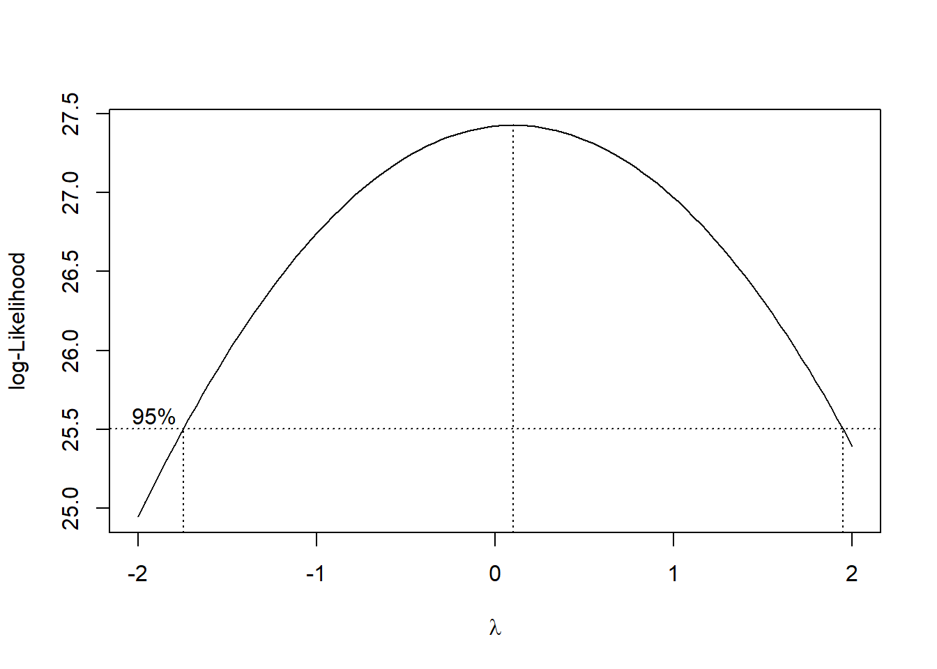
Let us fit a model with no interaction between the predictors, and conduct a general linear F test to see if we can drop the interaction terms:
##no interactions
result.no.akdc.reduced<-lm(PAY~AREA+SPEND, data=data.no.akdc)
##general linear F test
anova(result.no.akdc.reduced, result.no.akdc)
## Analysis of Variance Table
##
## Model 1: PAY ~ AREA + SPEND
## Model 2: PAY ~ AREA * SPEND
## Res.Df RSS Df Sum of Sq F Pr(>F)
## 1 45 204237951
## 2 43 185418192 2 18819759 2.1822 0.1251So we can drop the interaction terms. To be complete, you may want to reassess the regression assumptions for the model with no interactions, although removing insignificant terms usually does not affect the residual plot by a lot.
Partial regression plots
We can use the avPlots() function from the car package to create partial regression plots:
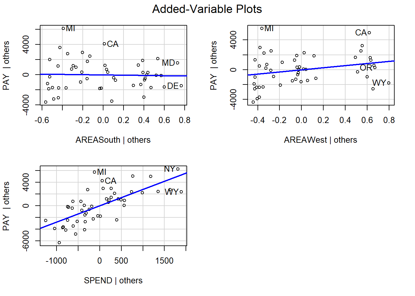
Partial regression plots should only be used to assess coefficients associated with quantitative predictors. The partial regression plot for the predictor SPEND has the plots evenly scattered on both sides of the blue line, indicating that we do not need to transform it. This should not be surprising given that the residual plot for the model does not indicate that the assumption that the errors have mean 0 was violated.
Please view the video below for a demonstration of this tutorial.